37 Gallery Wall Decor Ideas: Layouts And Styles to Elevate Any Room
Ever stood in front of an empty wall, scratching your head, wondering what to fill it with? You’re not alone. A bare wall can feel as inviting as a dentist’s waiting room.
The good news, the right gallery wall decor idea can fix that in a snap.
Whether using family photos, pops of color, or mixed frames, there’s a layout to suit any room or style. Try a playful grid for order. Mix art and mirrors for flair.
The trick: work with balance, but let your imagination lead.
1. Symmetrical grid layout with equal-sized frames in a perfect grid
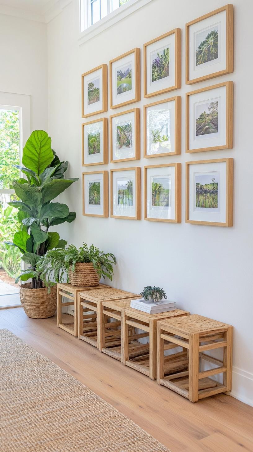
Imagine a row of six square frames, each holding a different black-and-white photograph, hung in precise alignment. This symmetrical grid layout exudes order, making it ideal over a sofa or bed.
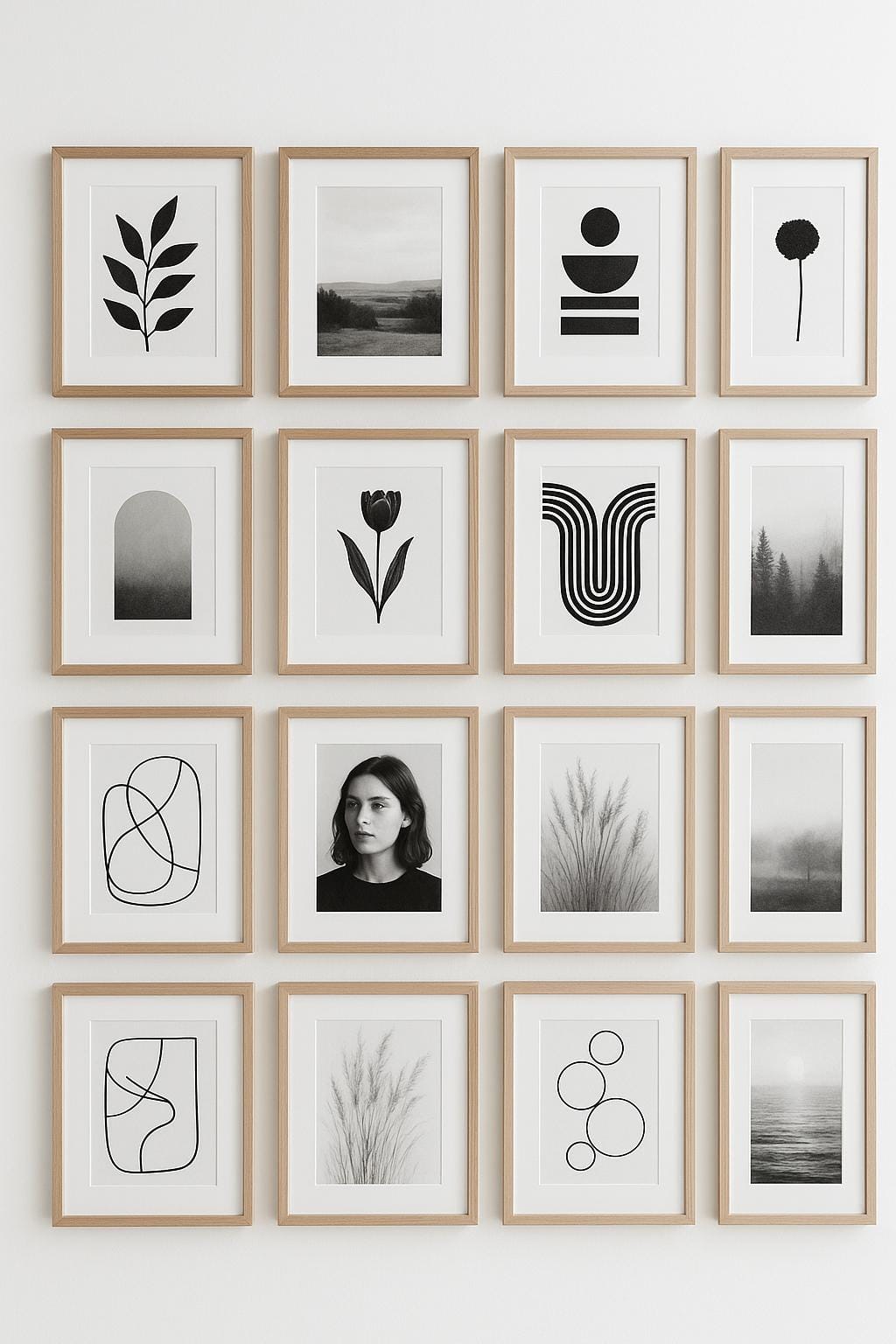
The crisp lines create instant serenity, but beware: a crooked frame will stand out like a sore thumb. Check levels carefully.
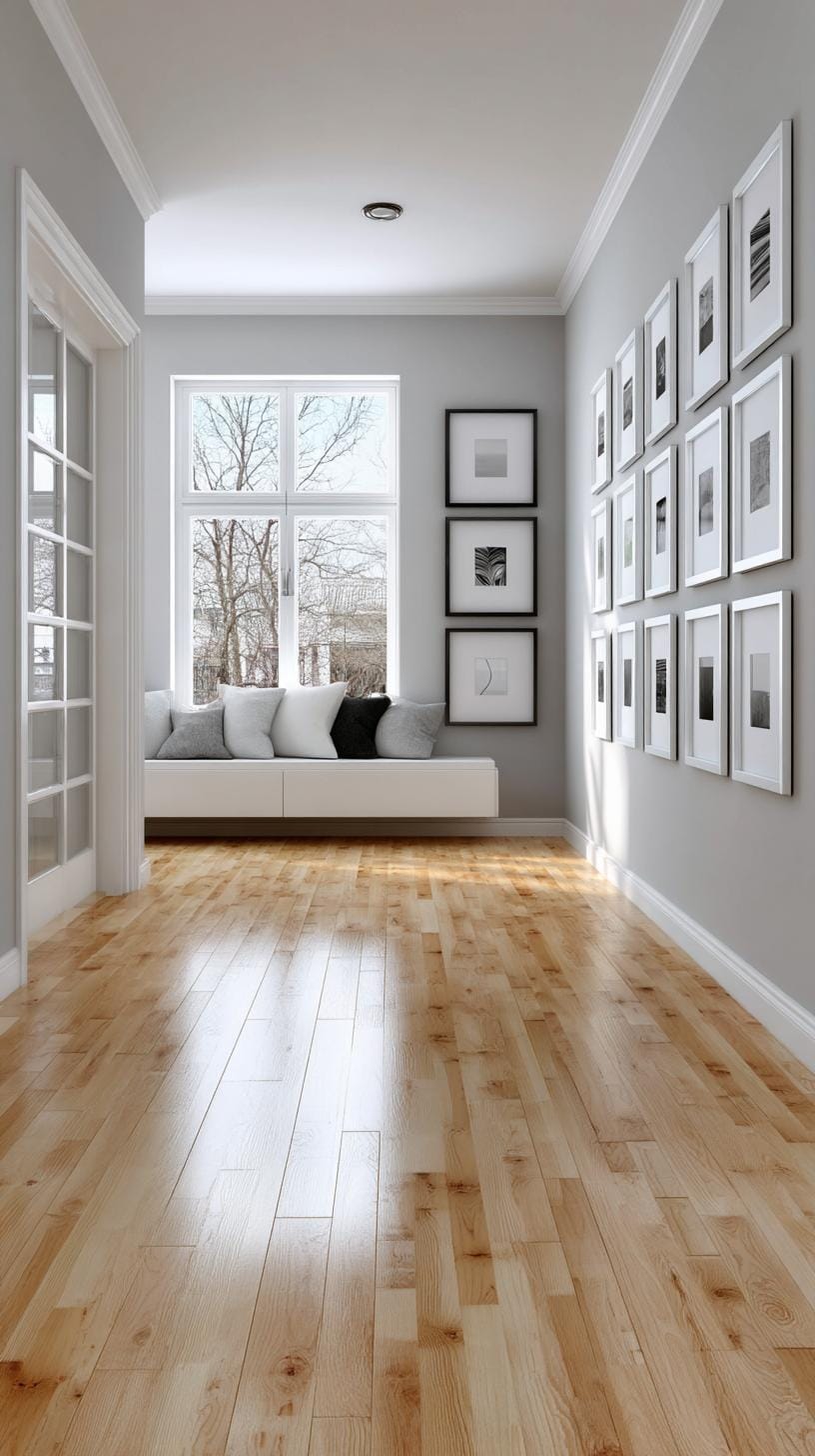
For impact, use matching frames and mats. Choose images with a common theme, family portraits or landscapes, for cohesion. IKEA’s RIBBA frames work well for this setup, offering affordability and uniformity.
If your walls are uneven or you’re fussy about absolute symmetry, you might find the setup process a tad finicky.
2. Eclectic vintage cluster using mismatched antique frames around vintage prints
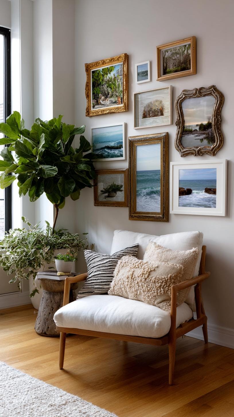
Grandma’s attic meets modern flair, think antique frames, none quite matching, circling a collection of vintage botanical or travel prints. You’re not striving for symmetry; let each piece stand apart.
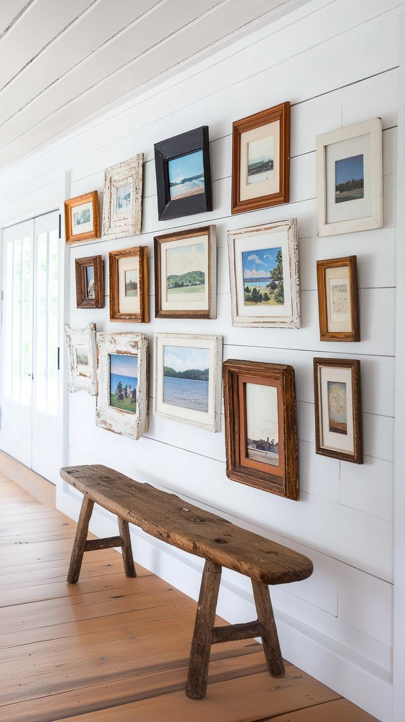
Play with frame shapes, hues, even a touch of tarnish. The result? Surprising character with a storybook vibe.
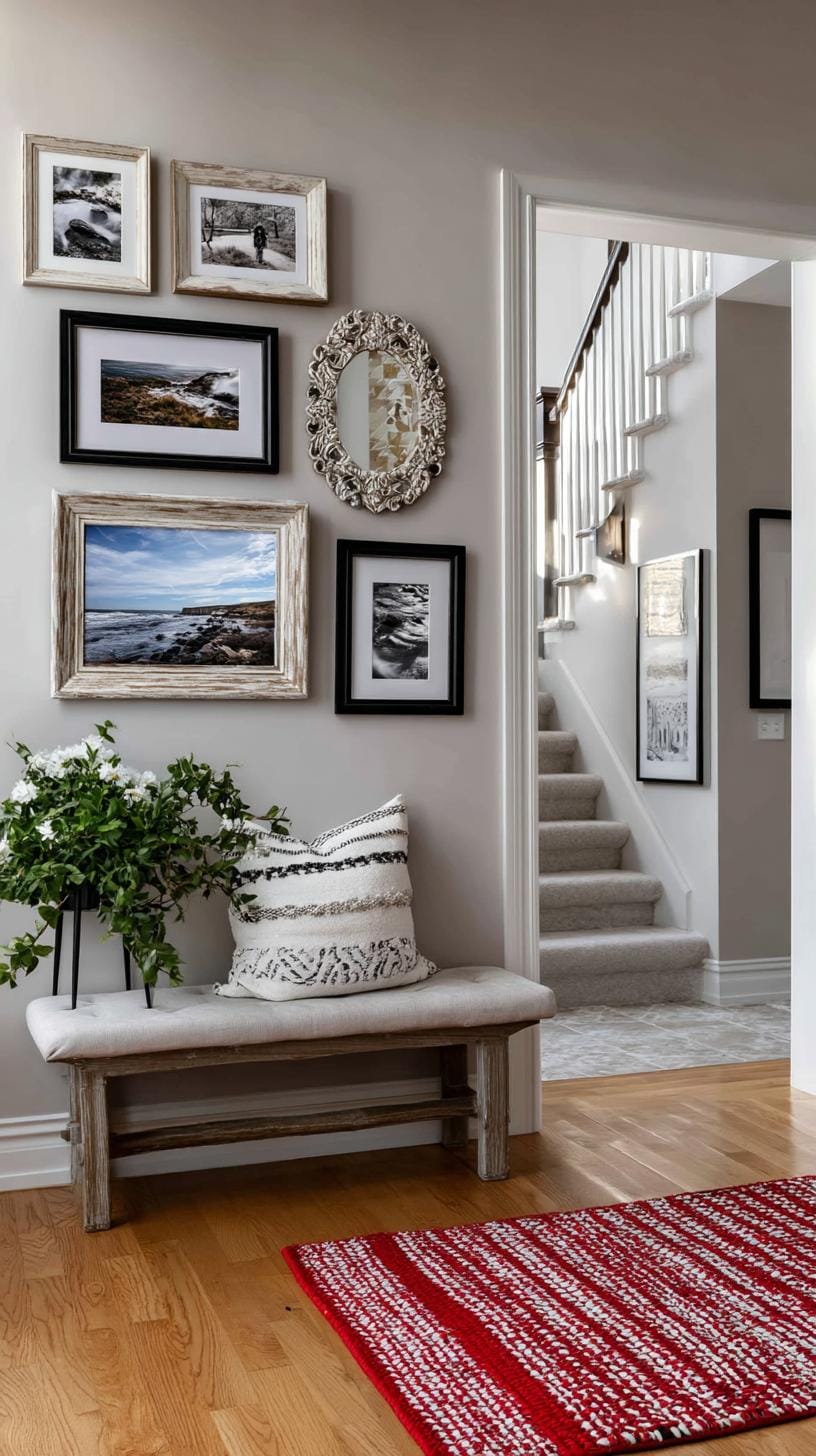
Start by arranging frames on the floor first. Test different groupings before hammering those nails. Odd numbers often look best.
This layout feels cozy yet sophisticated, but beware clutter: too many ornate frames can overpower. Leave breathing space between pieces and keep the prints thematically related for a pulled-together effect.
3. Floor to ceiling column made of a tall narrow vertical row of photos
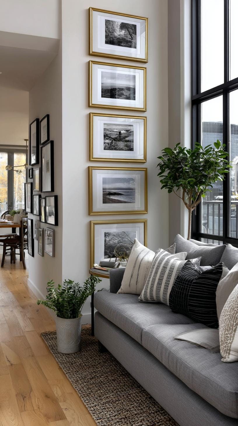
Consider a vertical photo column stretching from floor to ceiling. This layout works brilliantly in tight spaces such as hallways or beside doors. It draws the eye upward, making ceilings seem taller.
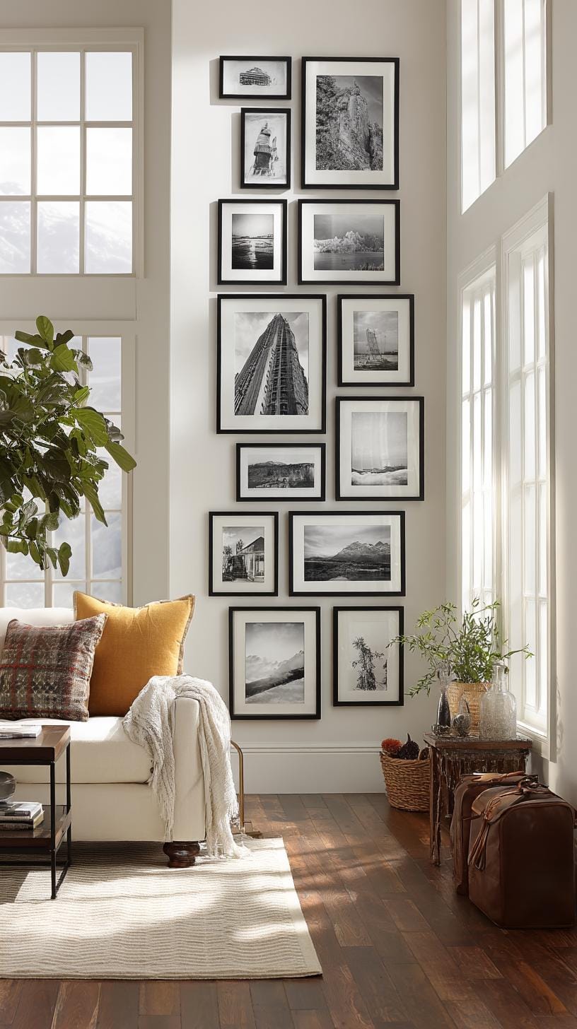
Try mixing black-and-white portraits with colored prints for extra impact. Keep frames consistent for a sleek finish.
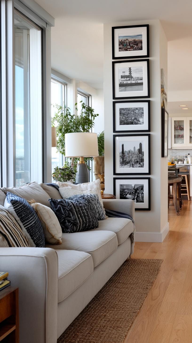
However, there’s a small hiccup. Dust loves to settle on lower frames, so you’ll need to clean more regularly. Are you a renter? Resist temptation, use removable wall strips instead of nails.
This way, you enjoy striking decor without risking your security deposit.
4. Over the sofa spread featuring horizontally aligned artwork above the couch
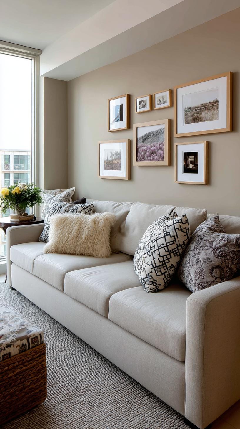
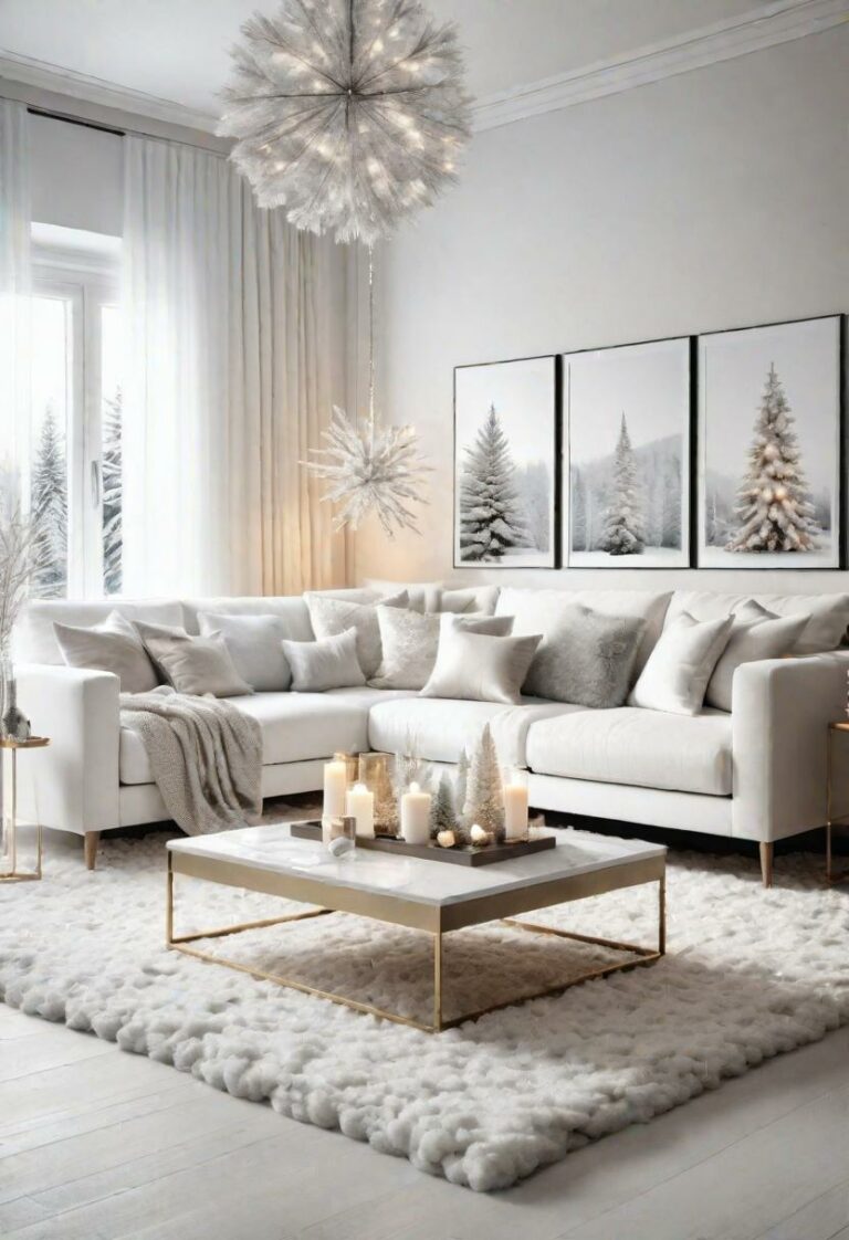
Placing a row of art above the sofa creates balance and draws the eye. Imagine three equally sized prints, edges aligned, forming one visual line.
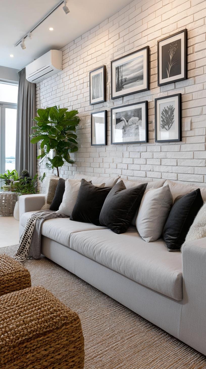
Want more personality? Mix frame colors, though spacing should stay uniform. This setup works well for landscapes, abstracts, or black-and-white photos.
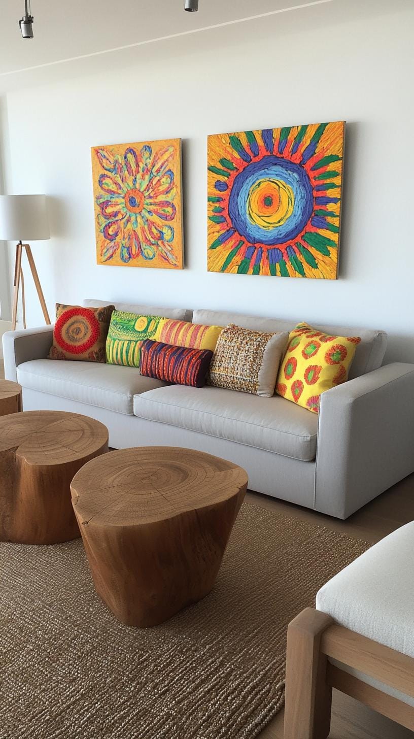
Think about scale. Art that’s too small can seem lost above a wide couch, awkward, like tiny shoes on a giant. Choose pieces that collectively stretch at least two-thirds the sofa’s width.
This method is simple to hang and update, but switching out one work often means rehanging the others for symmetry.
5. Spiral formation where artwork radiates outward in a swirl
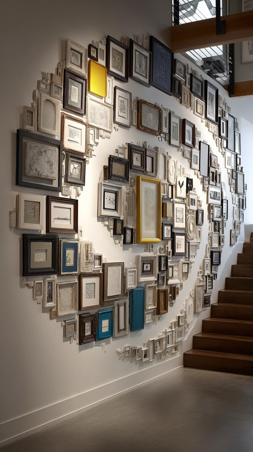
Who says art must live in strict lines? The spiral formation takes the ordinary gallery wall and gives it a twist, literally. Start with one central piece.
Let each artwork wind around it, growing out like cinnamon rolls straight from the oven. It’s both eye-catching and purposefully playful.
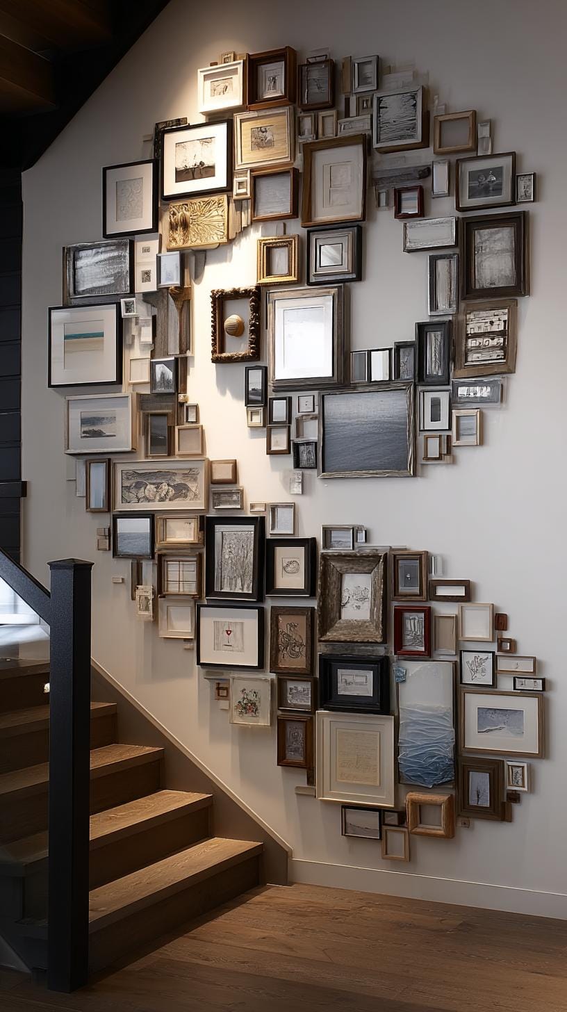
This layout offers flexibility for various frame sizes, allowing different shapes to intersect. However, balancing visual weight is key, or the swirl may become chaotic.
A central anchor, like a bold painting, supports cohesion. Ever tried this approach? It grabs attention, but be warned: precision helps prevent a lopsided whirl.
6. Frame free art wall with art taped or pinned directly without frames
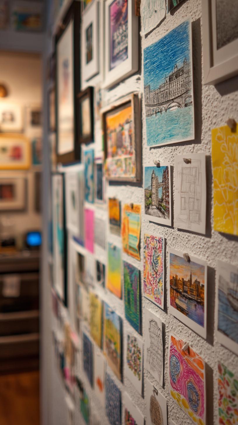
Why bother with frames at all? Taping or pinning art straight to the wall keeps things fresh, casual, and wallet-friendly. It’s flexible, change pieces as your tastes shift.
For instance, hang postcards, sketches, or magazine clippings in a loose grid or zigzag line. Experiment without commitment.
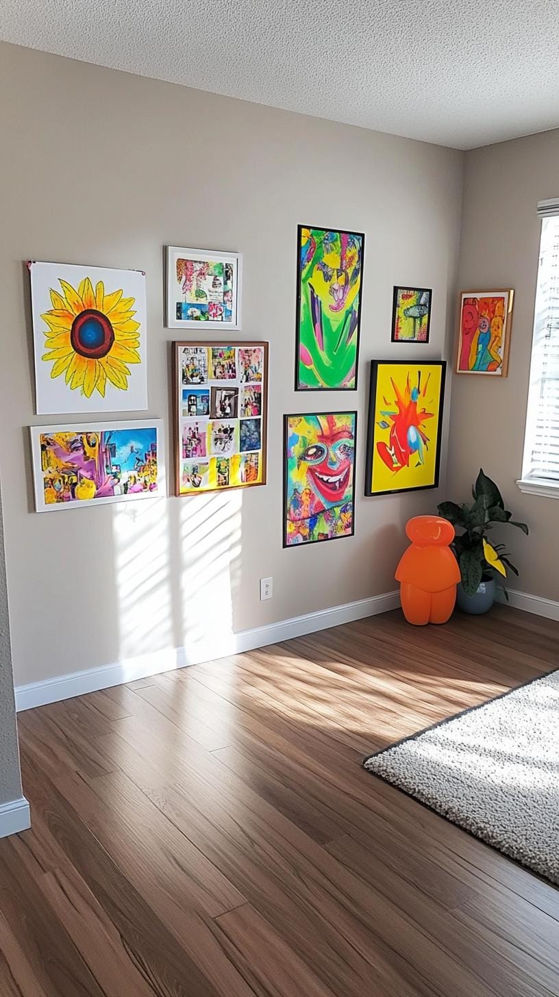
This method isn’t immune to flaws. Without frames, paper edges may curl over time or art could tear, especially in humid spots.
Still, pins and artist’s tape leave fewer holes and marks compared to heavy hardware. Use washi tape for a pop of color and easy repositioning.
7. Gallery ledge shelf style using leaning framed prints on floating shelves
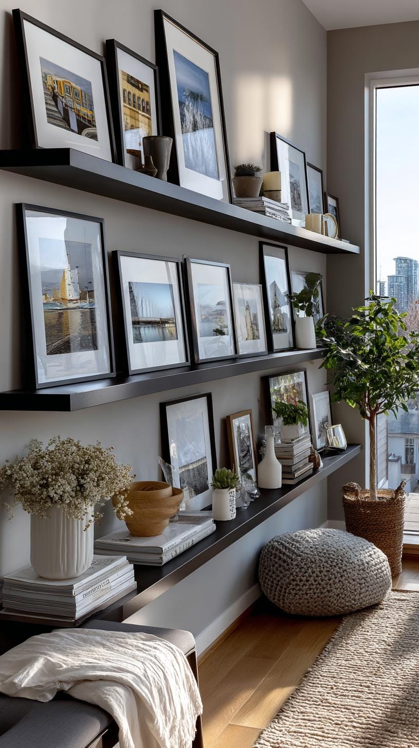
Forget endless hammering. The gallery ledge shelf calls for a simple floating shelf and a mix of framed prints, just propped up instead of nailed down.
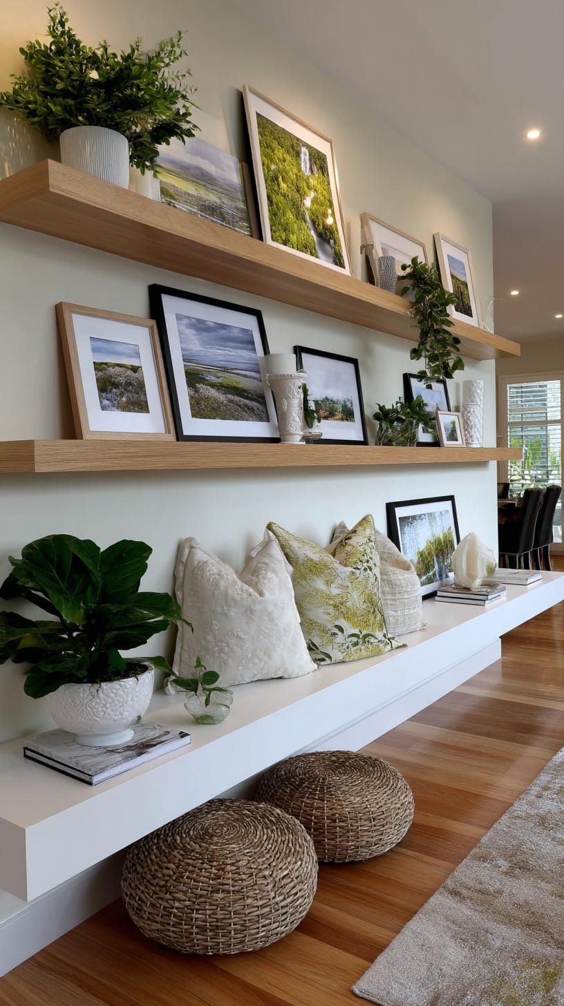
This lets you tinker with photo order or swap in new art as often as your mood changes, no headaches, no messy patches required.
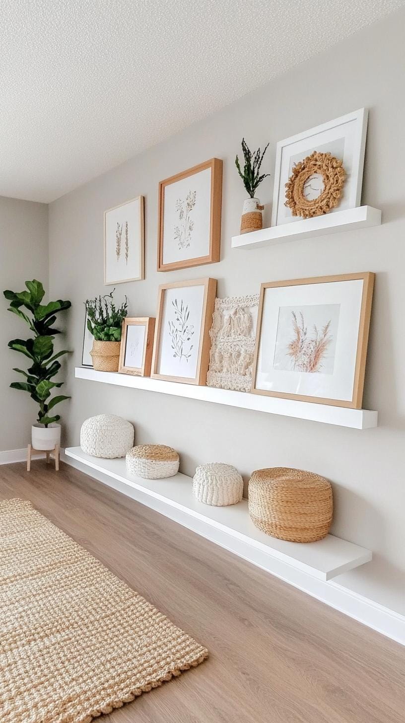
Think about arranging pieces by similar colors or mixing frame shapes for a punchy effect. For renters or design butterflies, this setup is heaven-sent.
One slight catch? The shelf needs regular dusting, and too many frames can look cluttered if you don’t edit. But the freedom is worth it.
8. Minimalist monochrome grid composed of same size black and white photos in symmetry
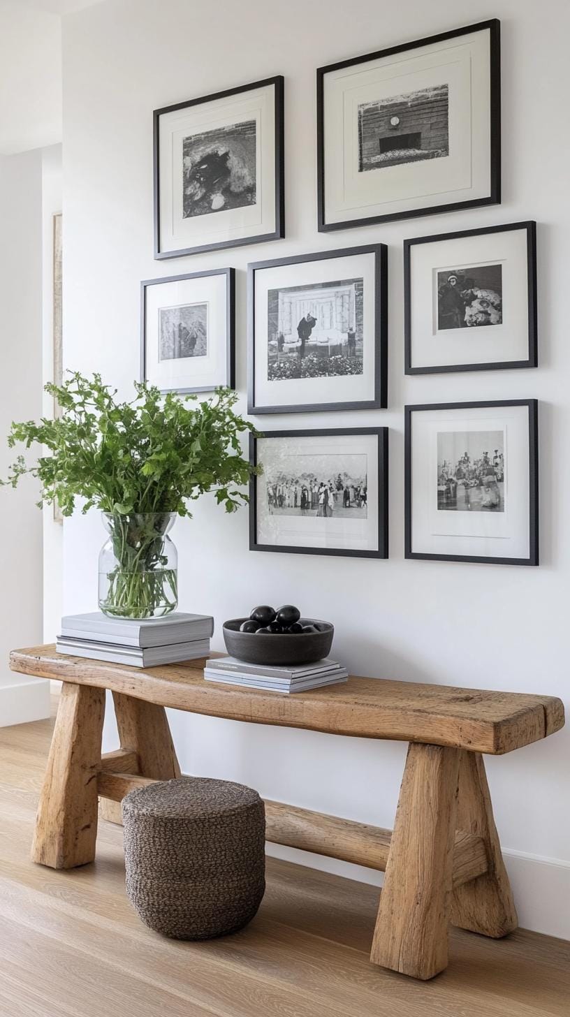
Nothing speaks of quiet sophistication like a wall lined with identical black and white photos in a neat grid. The effect is striking and modern.
It’s a favorite for art lovers who want order. Picture a three-by-three square, nine frames, all spaced evenly. Guests will comment on its calm, gallery-inspired feel.
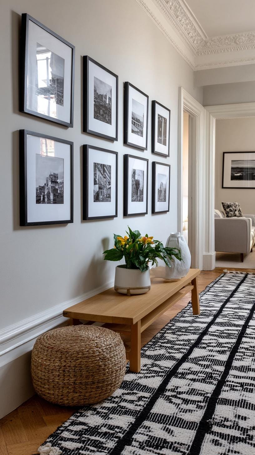
Symmetry provides a sense of balance, making spaces appear crisp and intentional. Selecting just one type of frame simplifies decisions. Don’t overthink the subject matter, photographs of nature, cityscapes, or even family portraits work.
The downside? Some may call it too orderly, but lovers of minimalism embrace the clean look.
9. Mixed material eclectic wall blending canvas mirrors plates and macramé
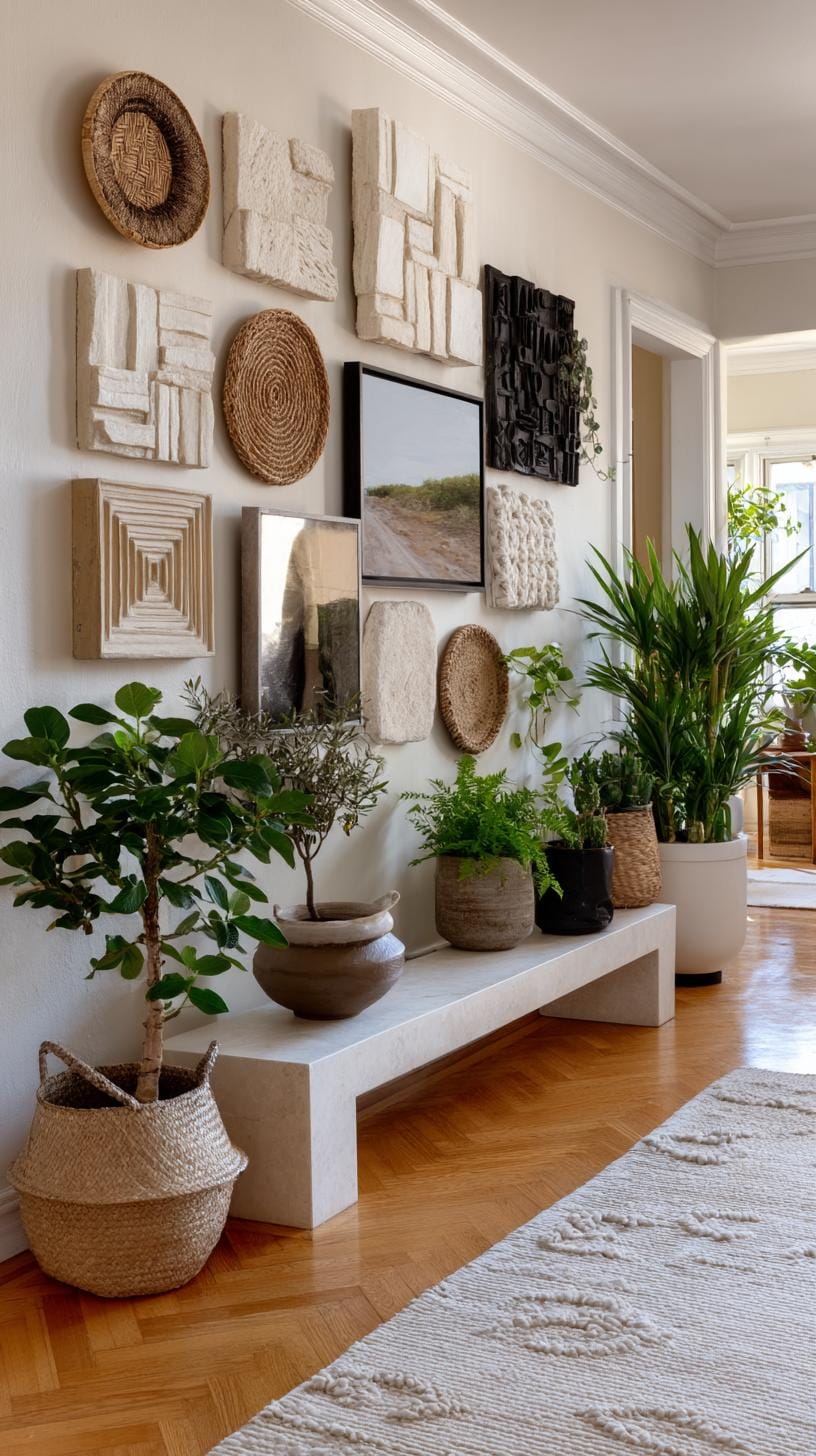
Ever considered hanging a shimmer of mirrors beside canvas paintings? Do it. The result feels playful yet collected. Add vintage plates, suddenly, your wall speaks with texture and history.
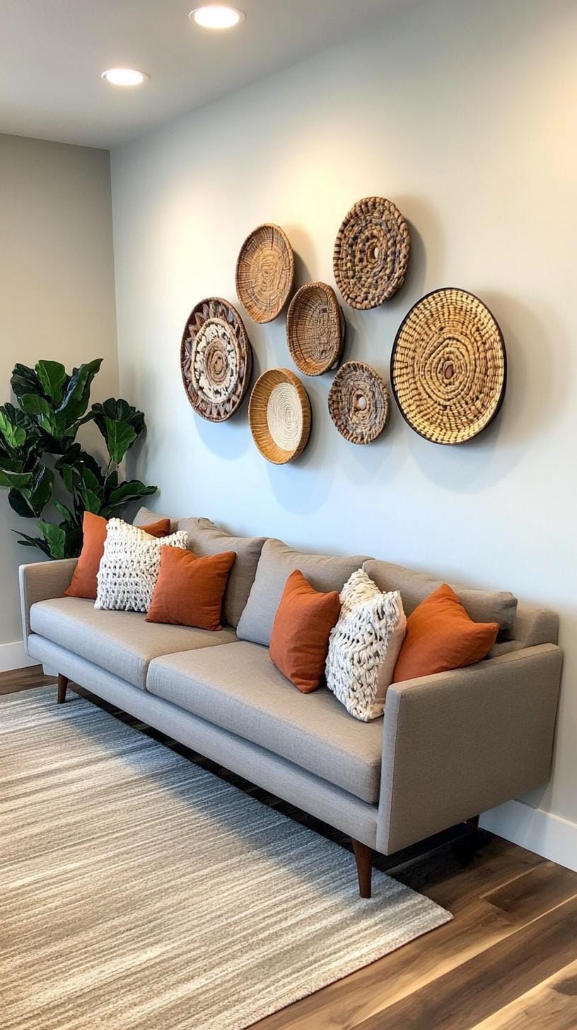
Throw in a macramé piece. Now you’ve created a subtle wink to boho style, minus the overwhelming clutter.
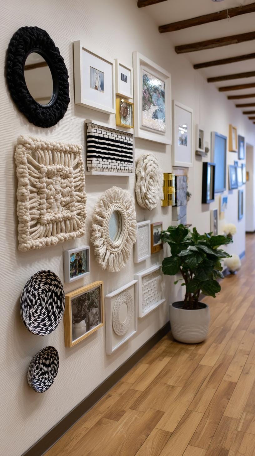
Think about positioning. Odd numbers work; try a triangle or off-center grouping. Use mirrors to bounce light. Hang macramé low for depth.
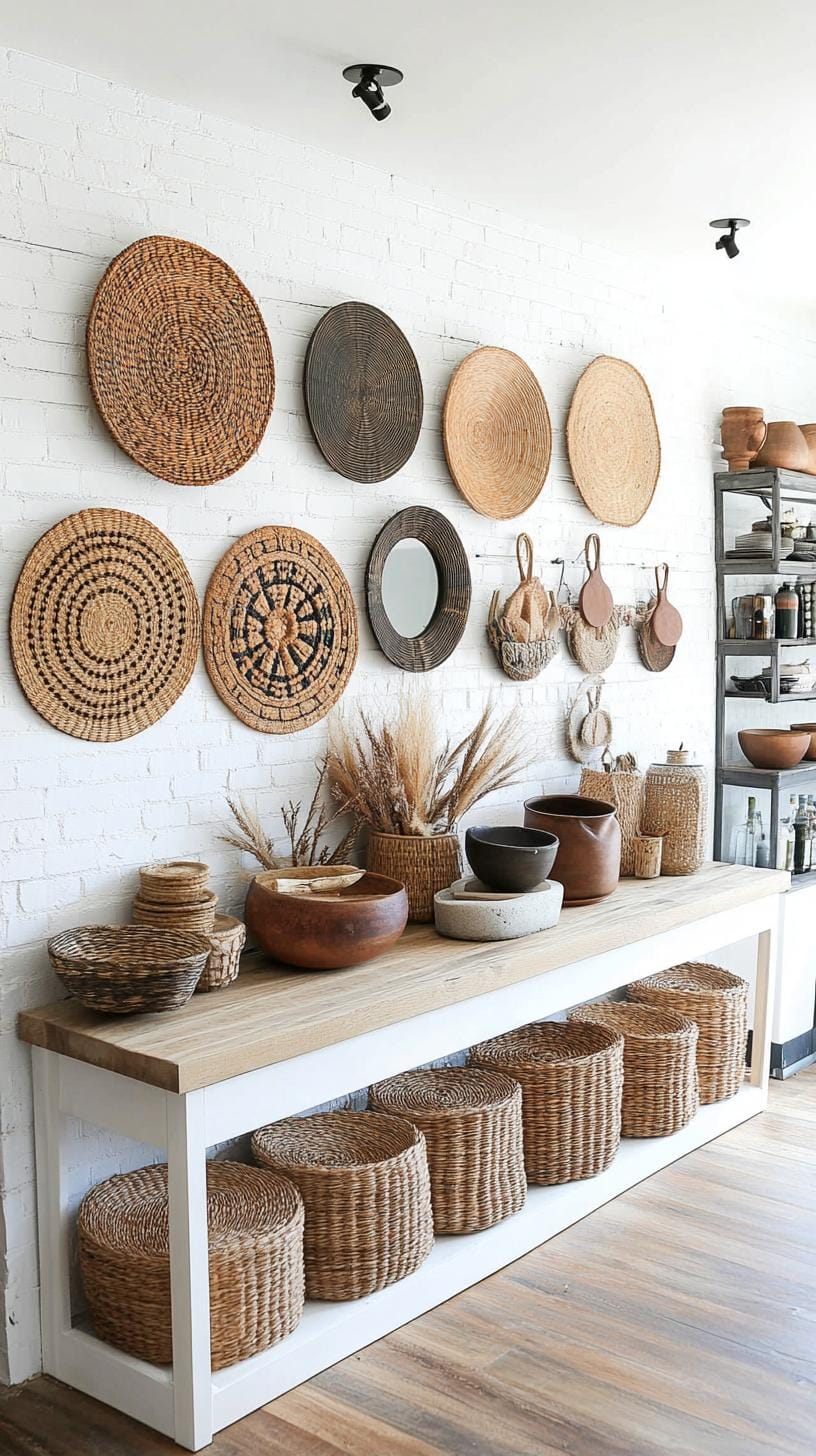
Not every item needs to match, but colors should sing together, not squabble. This style invites bold choices, but too many elements risks chaos. Curate with a gentle hand.
10. Staircase step alignment with art staggered to follow the stair slope
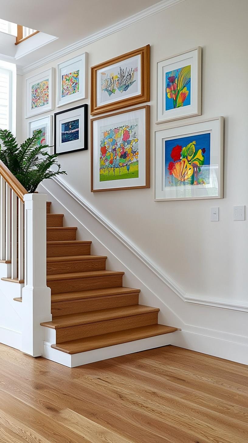
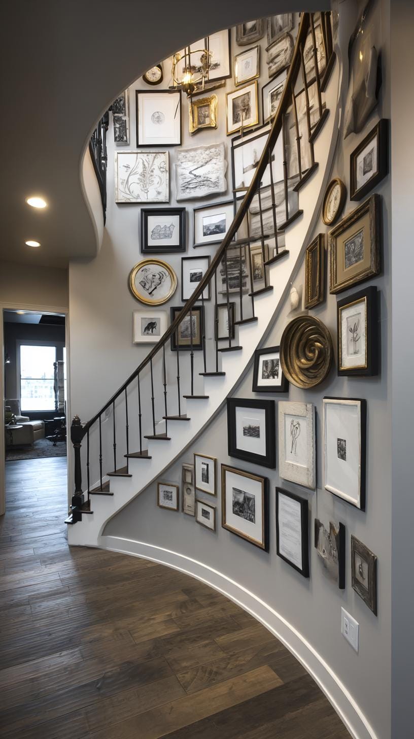
Mounting art in line with each stair step can add rhythm and energy. Staggering frames along the stair slope mimics the movement of climbing, keeping the eye moving upward.
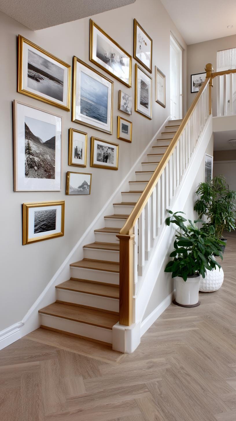
A great example: alternate different frame sizes, echo the angle of the steps, and play with bold or neutral colors for contrast.
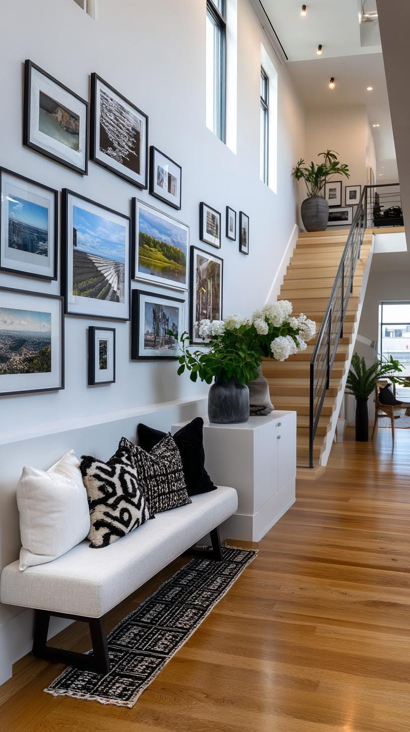
However, it’s easy to get carried away. Overcrowding with too many pieces can feel like visual clutter.
Pick a simple selection, maybe family photos or vintage prints, and resist the urge to fill every available inch. Less is sometimes more, especially in high-traffic spots like a staircase.
11. Salon style maximalism where the entire wall is covered with layered artworks
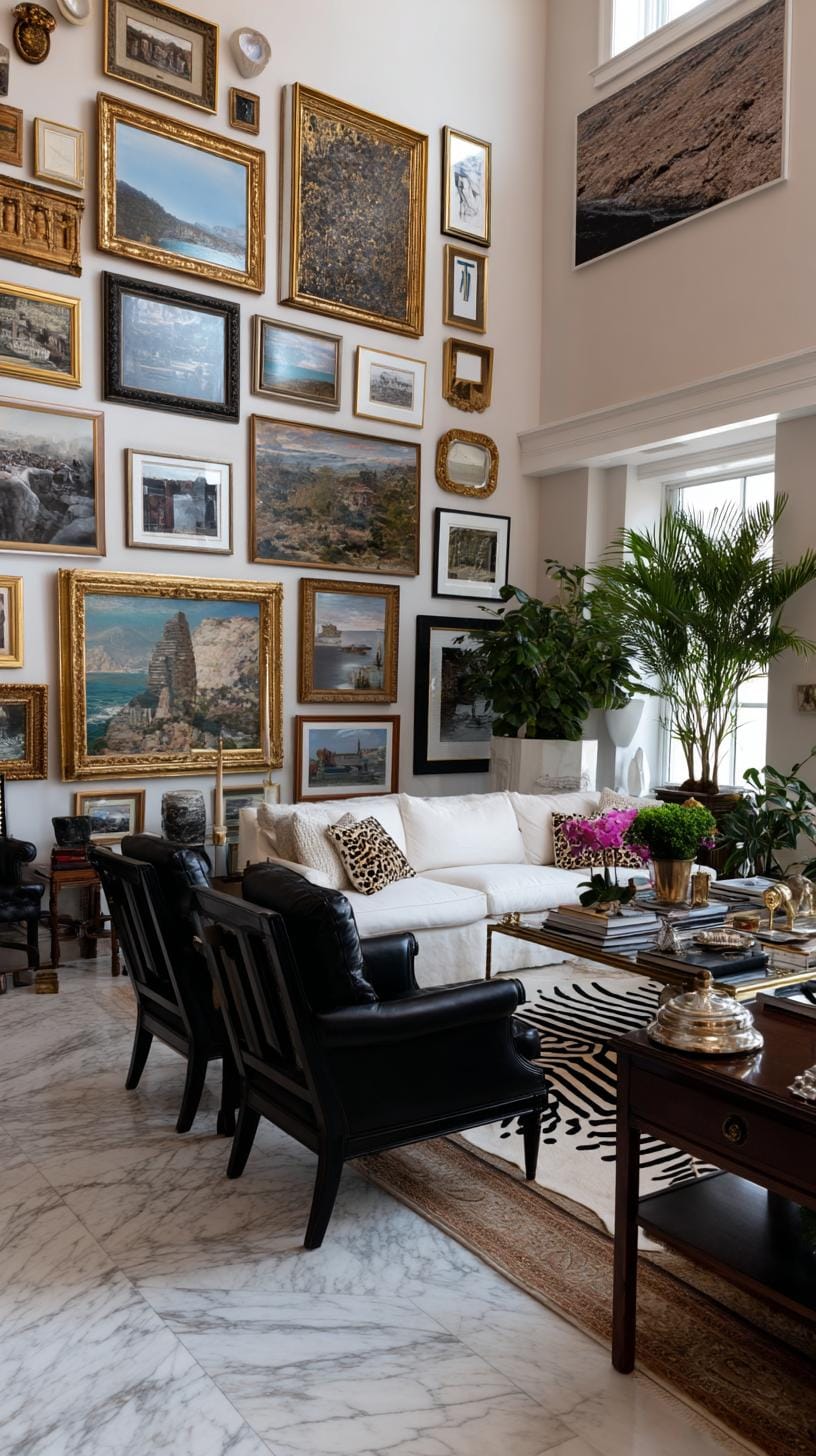
Salon style maximalism throws restraint out the window. Imagine a wall entirely blanketed with paintings, prints, and oddities, each jostling for attention. It’s dramatic and a whisper to bohemian flair.
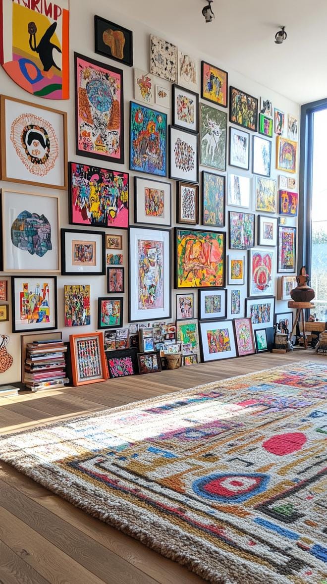
Why hide your passion? Lean into organized chaos by mixing sizes, dense spacing, and even overlapping. Visual intrigue guaranteed.
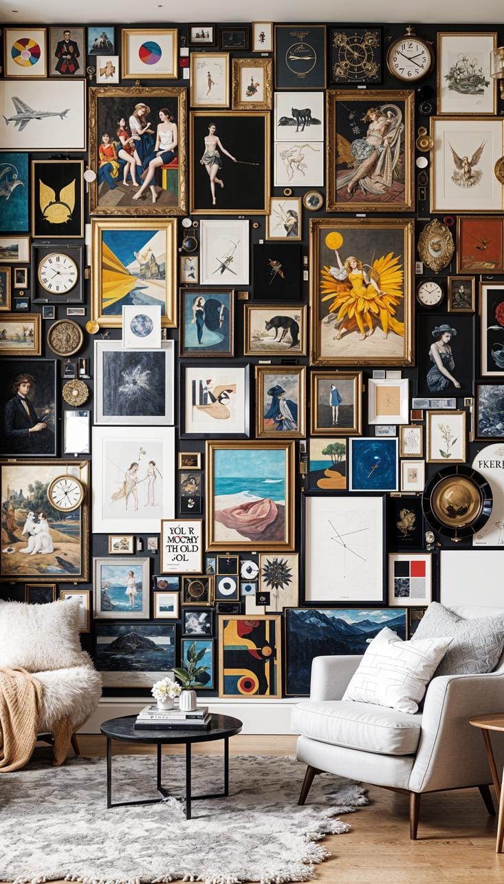
Consider practical aspects before hammering nails. Too much layering can swallow a room, so try a paper template first. Don’t fret over matching frames, eclectic wins.
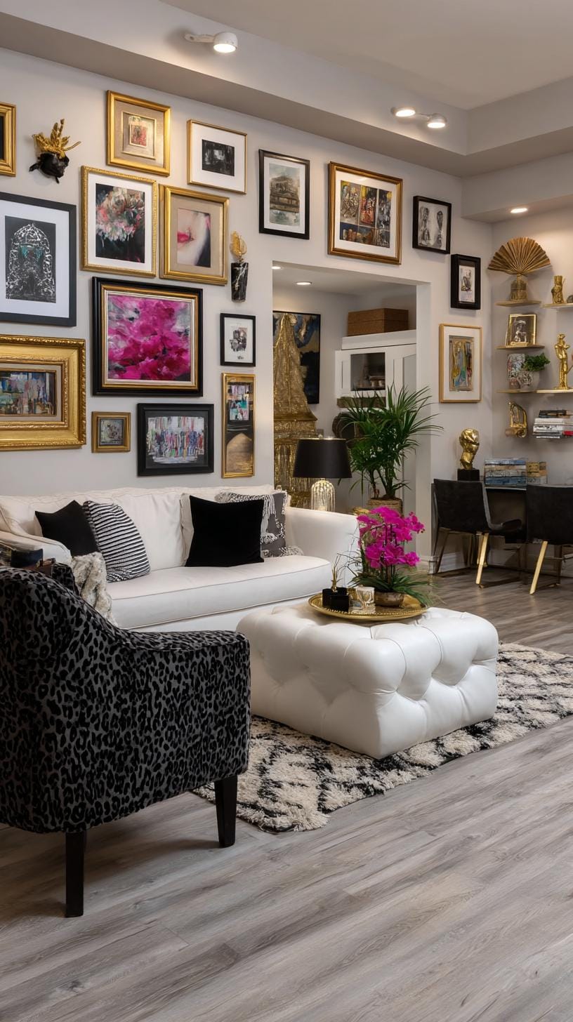
Art ranging from vintage posters to family snapshots adds warmth. The magic lies in fearless abundance, not strict symmetry. Ready for compliments and conversation starters?
12. Chevron gallery formation arranged in a V shaped chevron pattern
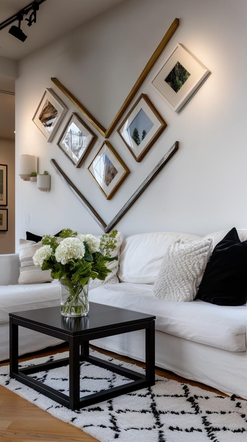
Try arranging frames in a bold V shape on a blank wall. The Chevron gallery layout draws the eye and sparks conversation every time.
Place artwork in a staggered zigzag, using a mix of sizes to keep things visually interesting. This style is great for hallways and narrow spaces.
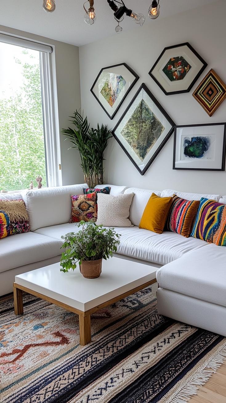
Some love the dynamic movement a chevron pattern offers, while others think it looks chaotic unless carefully balanced. If you’re not sure, start with paper cutouts to test the layout without commitment.
Mixing family photos with modern art adds warmth and keeps the pattern from feeling stiff.
13. Corner wraparound gallery that extends around an interior corner
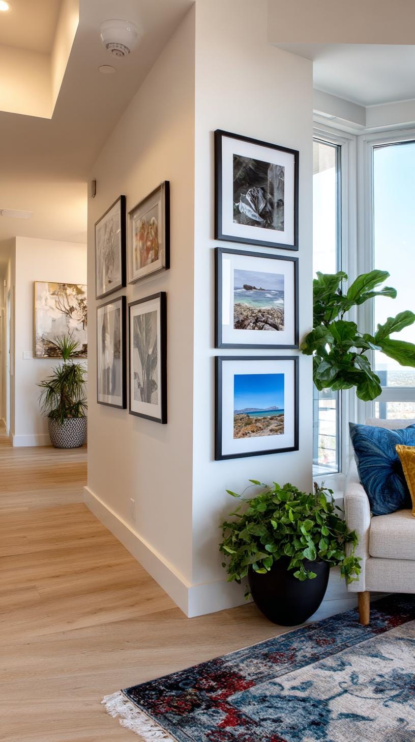
Think your boring corner can’t be spruced up? Corner wraparound gallery layouts prove otherwise. L-shaped arrangements allow art to flow freely across both walls, turning the whole area into an eye-catching spot.
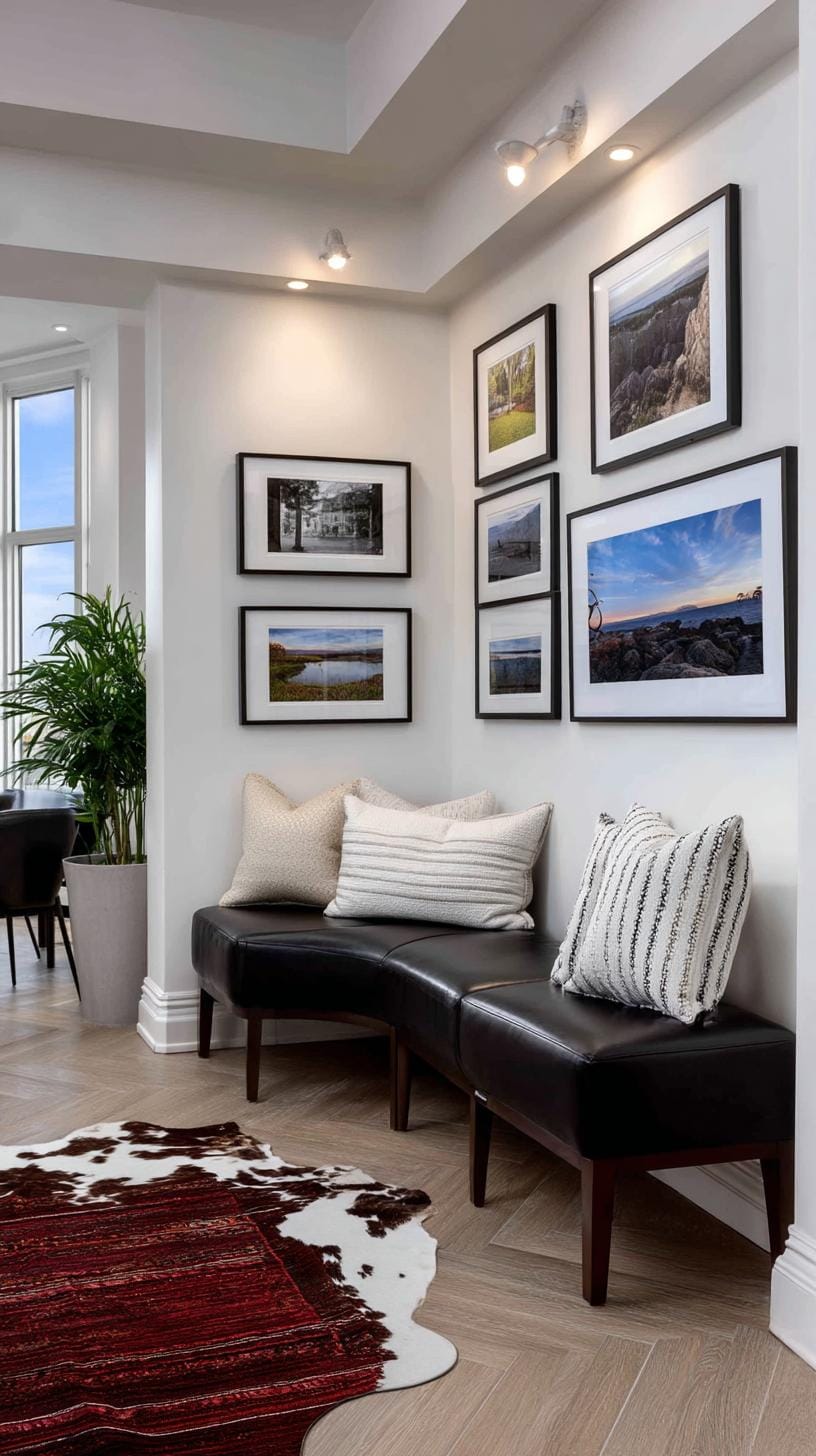
This method can showcase family memories, eclectic prints, or even vintage mirrors for extra flair.
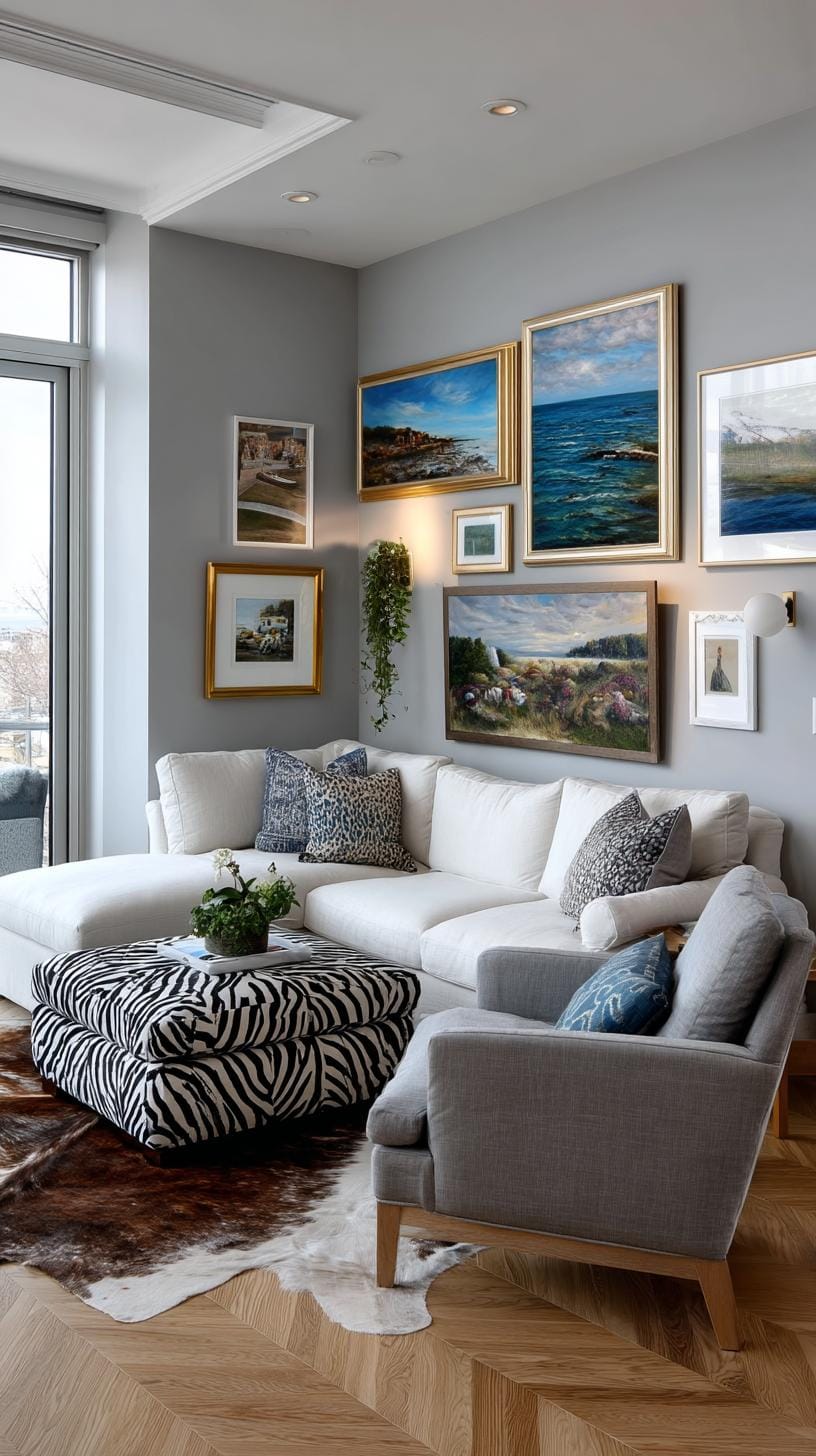
An easy trick? Pick consistent frames for unity, but let the artwork vary to keep things lively. Some homeowners love balancing symmetrical spacing; others lean into asymmetry for a more relaxed vibe.
Be careful: mismatched frame heights at the corner can be distracting. Planning with paper cutouts helps prevent missteps before you commit.
14. Bohemian frame mix with bold colors textiles and mixed shapes on the wall
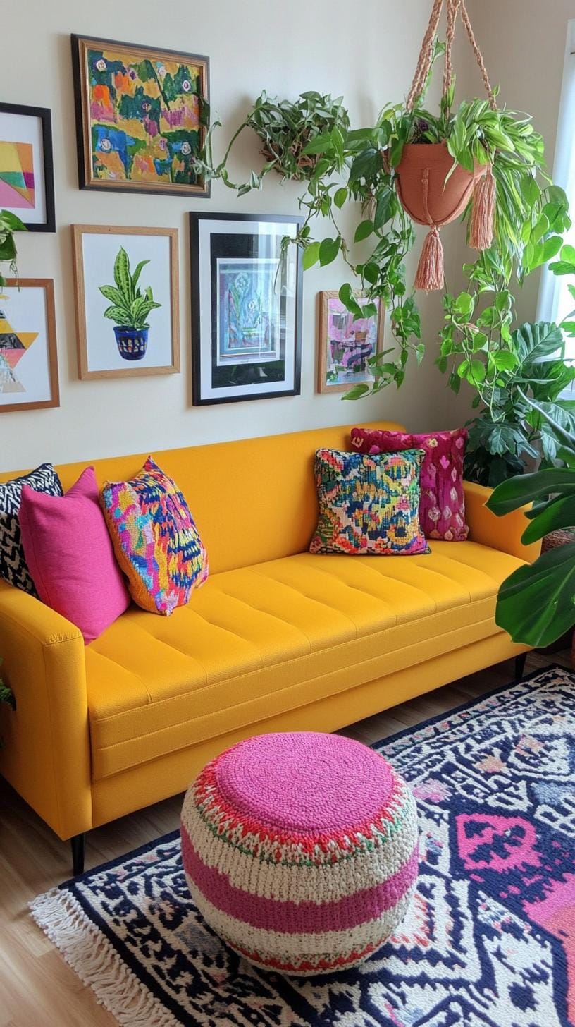
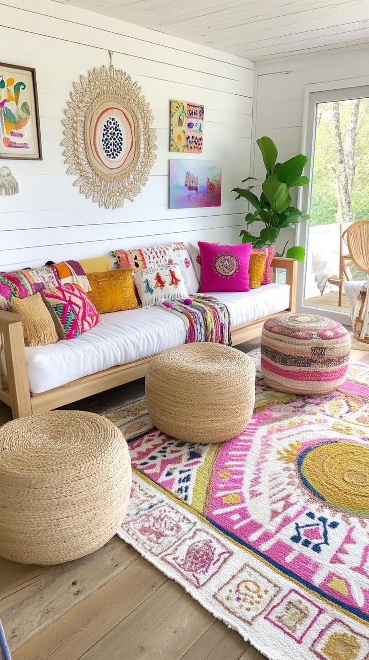
Why stick with neat symmetry when vivid textiles and freeform frames can spark energy in your space? Bohemian wall layouts shrug off stiff rules.
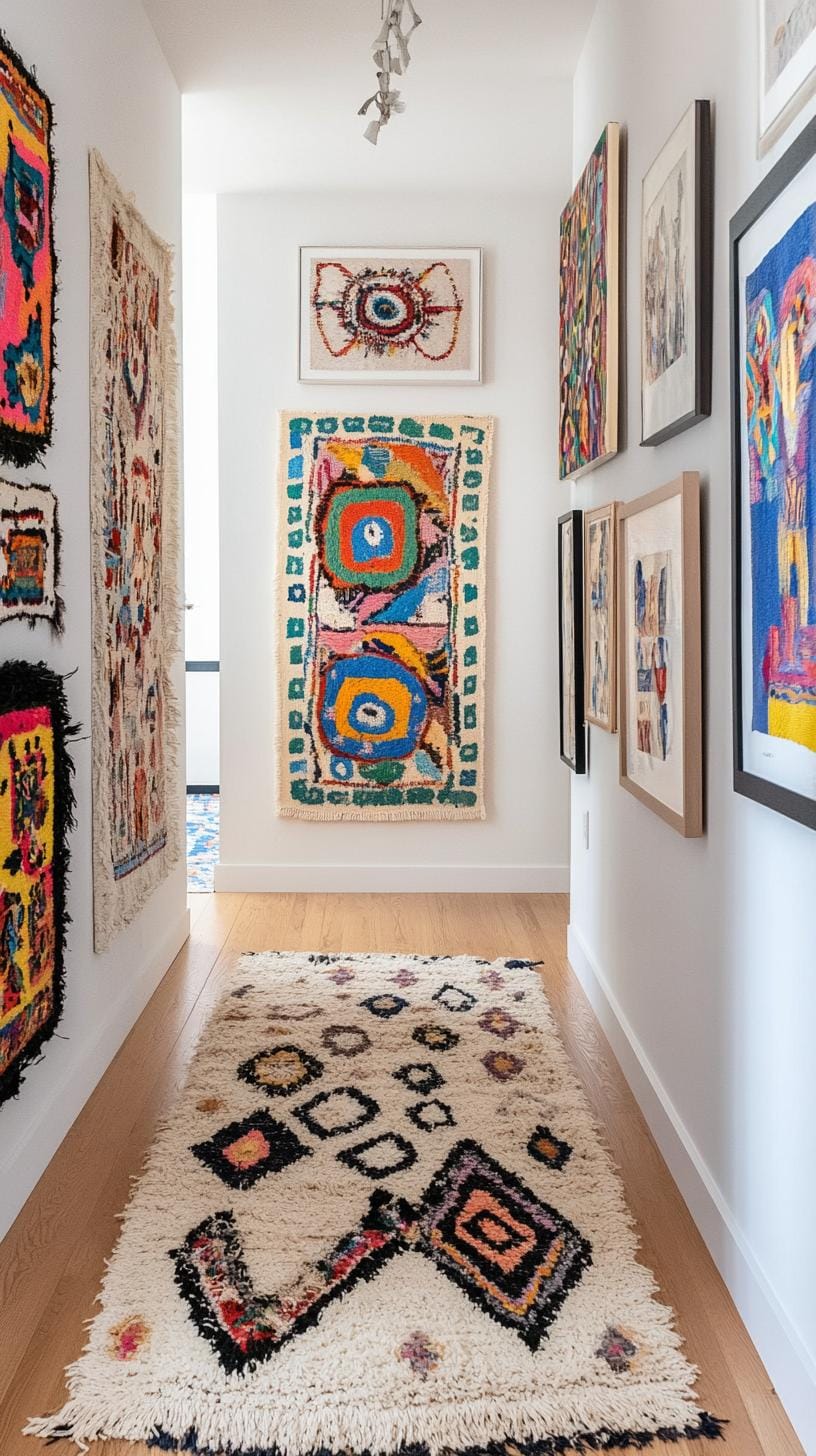
Combine round mirrors, ornate rectangles, and a splash of mismatched poufs or hanging fabric. Think cozy chaos, like a flea market haul displayed with wild abandon.
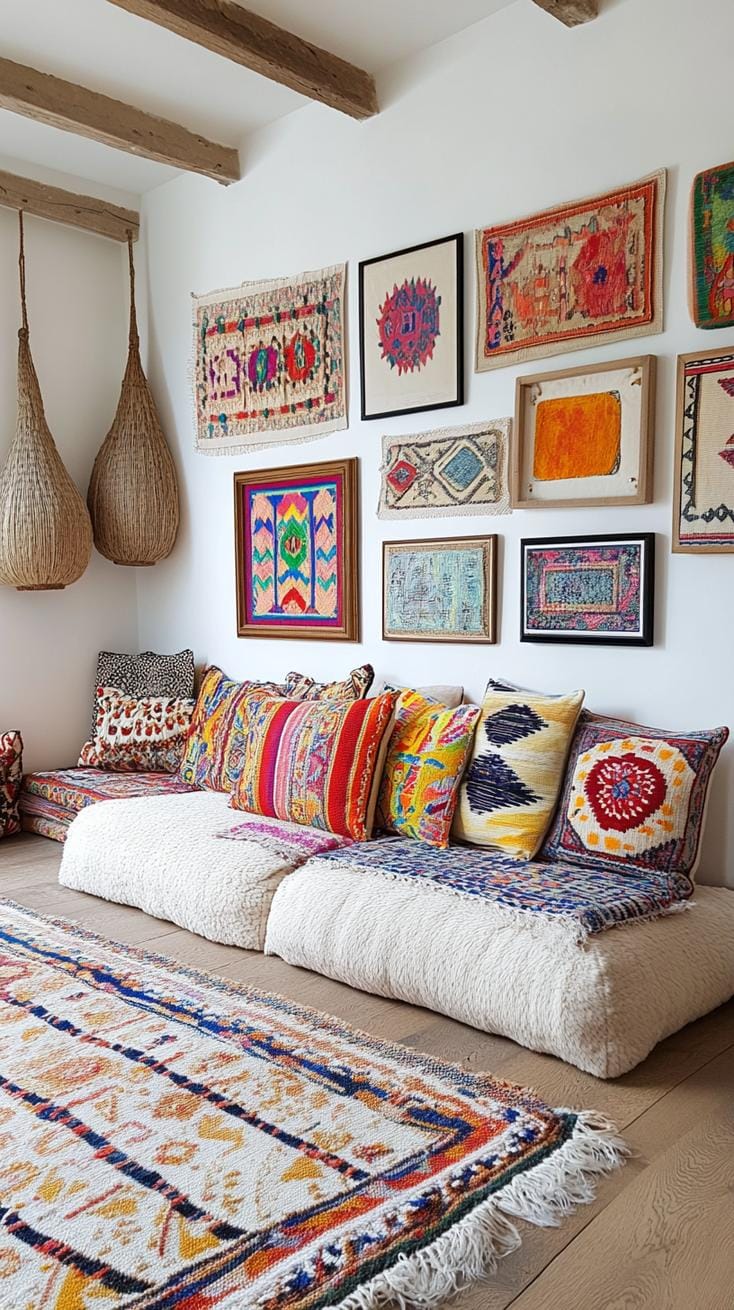
Experimenting pays off. Place a jewel-toned tapestry beside a vibrant woven basket and an abstract canvas. Use frames in gold, wood, or painted patterns to add contrast.
Sure, chaos can get overwhelming, choose a color anchor or anchor piece to keep things cohesive, not confusing. Let your wall tell its own story.
15. Single color pop wall using neutral tones with one bold art color
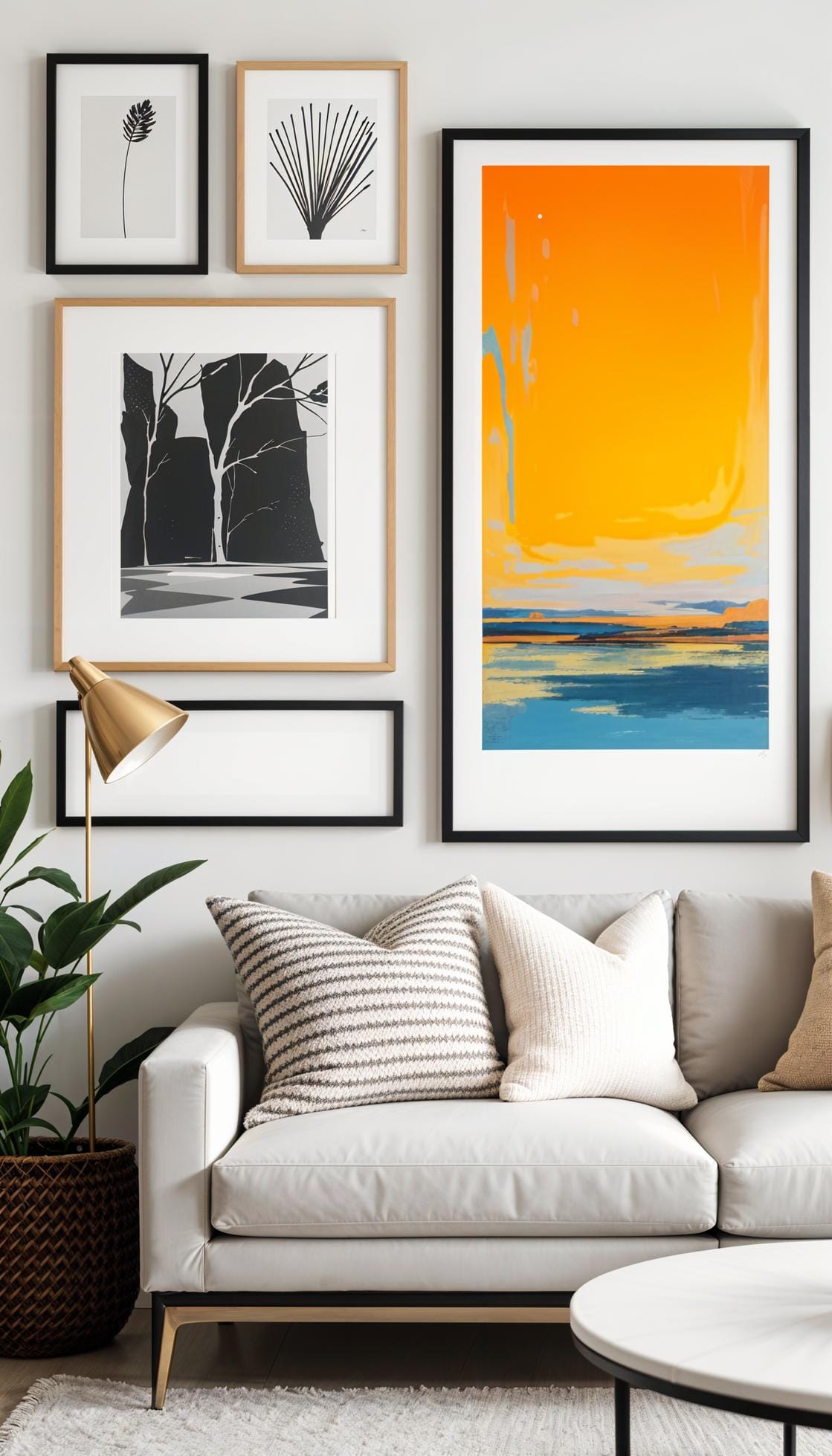
Imagine a room wrapped in soft grays and whites, suddenly interrupted by an electric blue painting. That one burst of color draws every eye instantly.
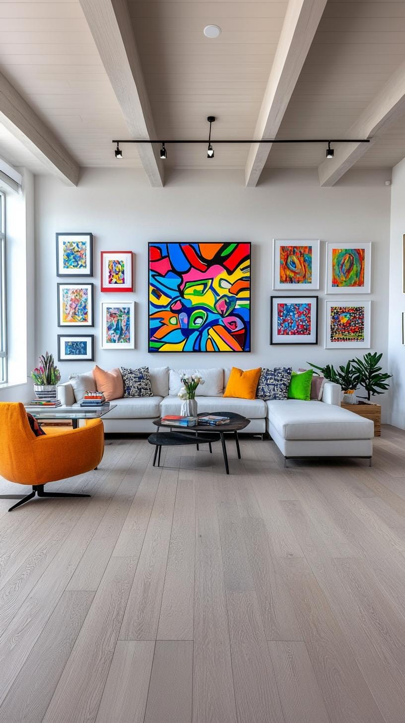
It’s like putting a cherry on top, simple, but unforgettable. Neutral surroundings help the artwork’s personality shine without any loud distractions or visual noise.
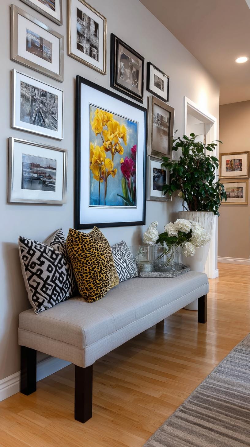
Choosing a bold central piece doesn’t mean chaos. Select a color that excites you, a fiery red, a grassy green, and keep everything else calm and balanced.
This setup works even for tiny apartments or overcrowded living rooms. One big win: easy updates. Replace the anchor artwork, and the space takes on a whole new mood.
16. Gallery wall around TV encircling a mounted television with art
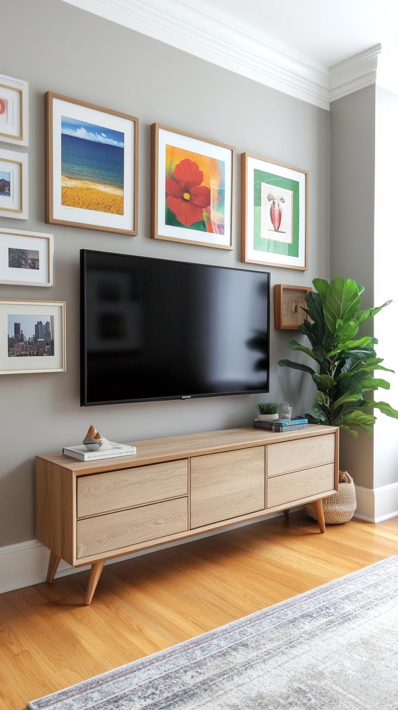
Think your TV wall is a lost cause? Think again. Surrounding a mounted television with art creates a clever disguise, turning your screen into part of a curated gallery.
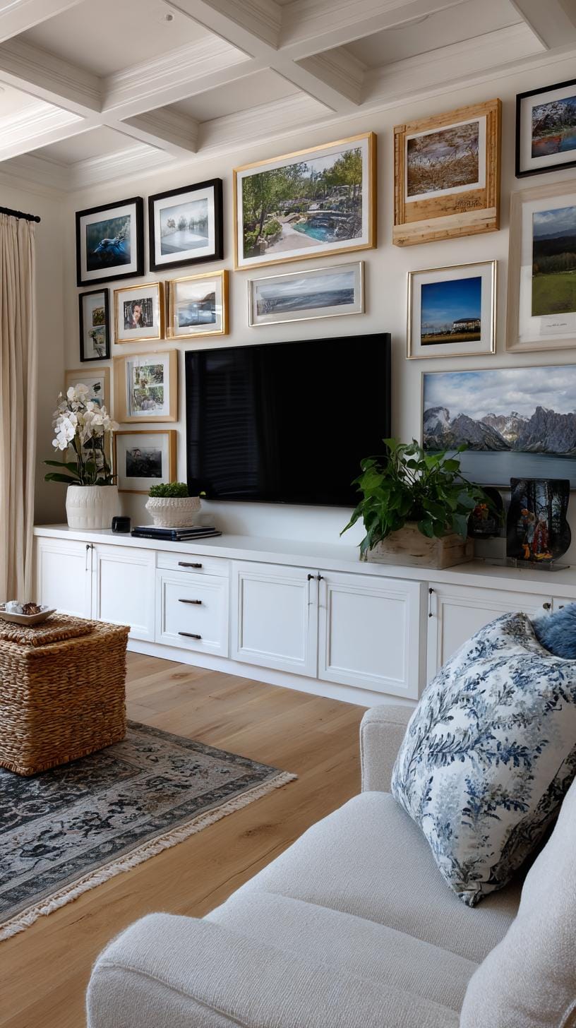
Try mixing frame sizes and artwork subjects, think abstract next to landscapes, for an eye-catching, lively space that feels less like a home theater.
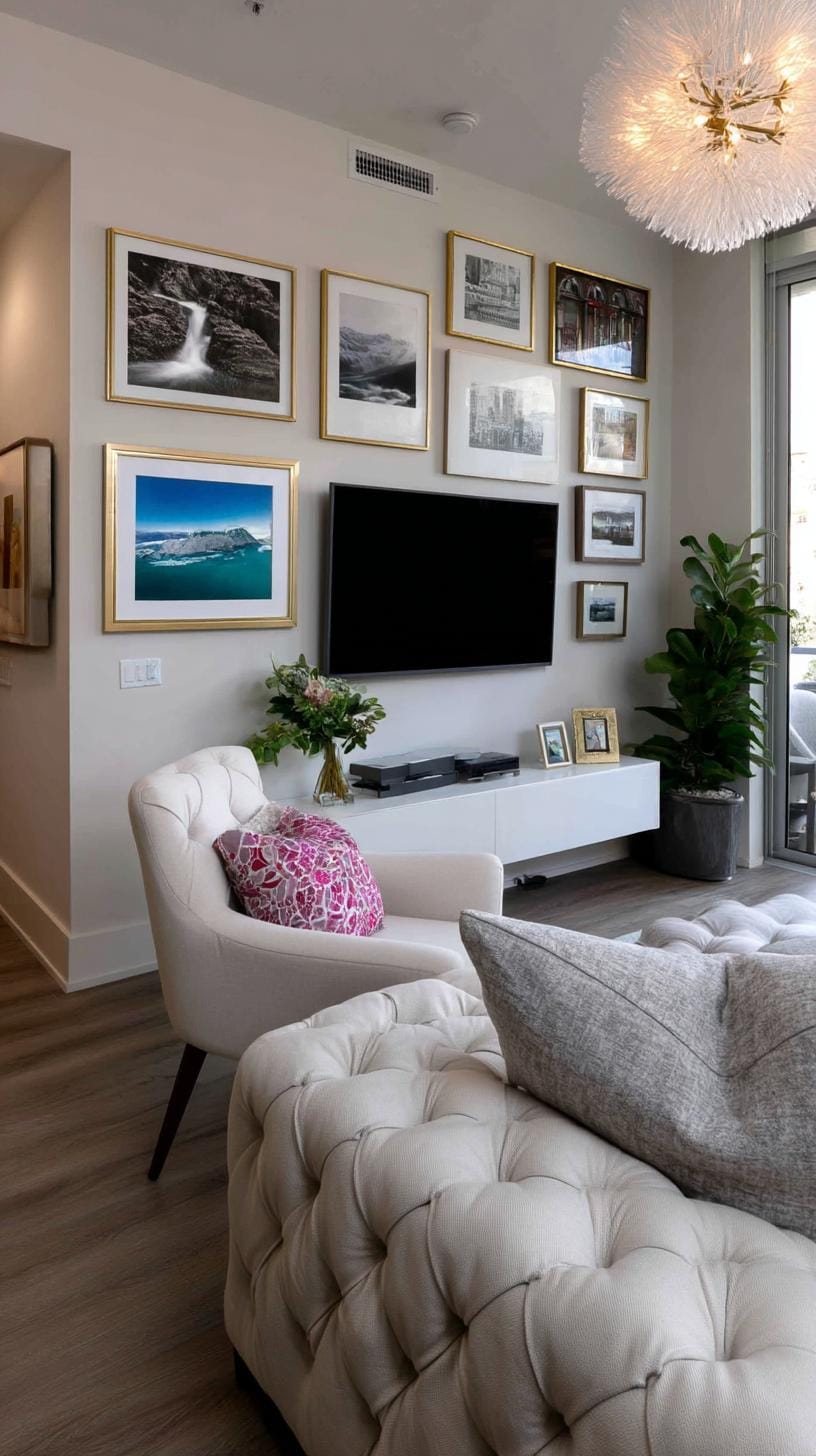
Some skip symmetry for a reason. Slightly uneven arrangements draw the eye, distracting from the TV as the main character. But be careful, overcrowding the space can make it look cramped.
Give each piece a little room to breathe, and your living room will thank you.
17. Grid with statement centerpiece using uniform frames and one large anchor piece
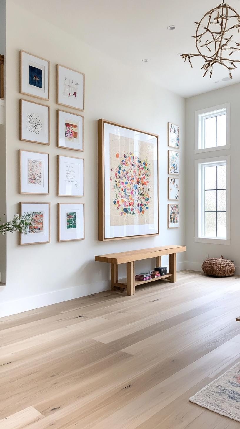
Imagine rows of identical frames arranged crisply, pulling the eye straight to one bold, oversized artwork in the center. This grid layout blends order with drama.
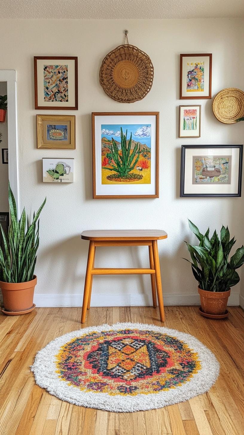
Simple black or white frames keep distractions at bay. The symmetry gives peace, while the large piece at the heart adds energy and personality.
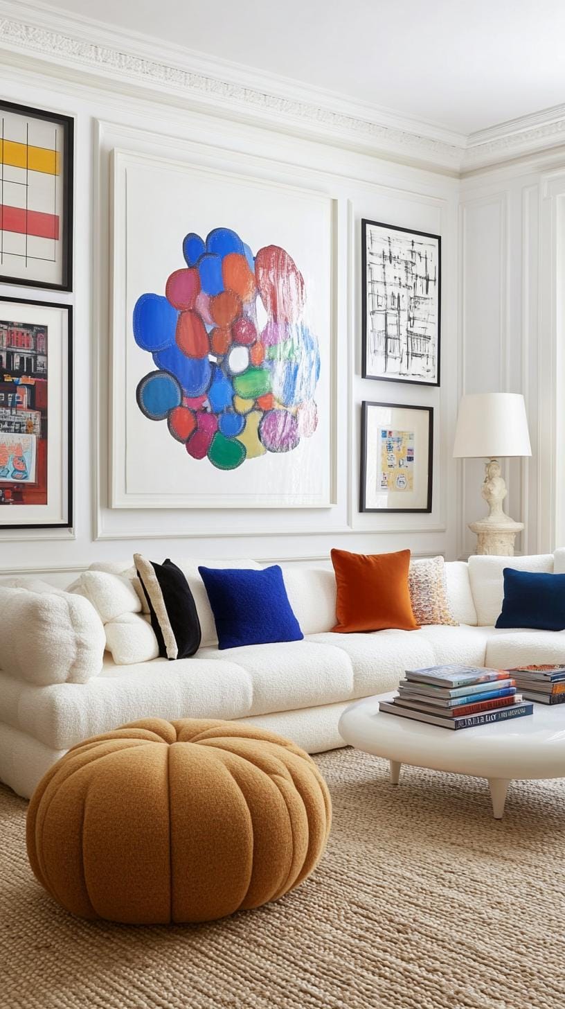
Some worry this style feels cold or repetitive. Not so, if you mix up the content, think family photos surrounding a vibrant painting, or minimalist prints flanking a bold abstract.
The trick is keeping frame size and spacing exact, with the big anchor snapping everything into focus.
18. Nature themed layout with botanical art and organic wood or gold frames
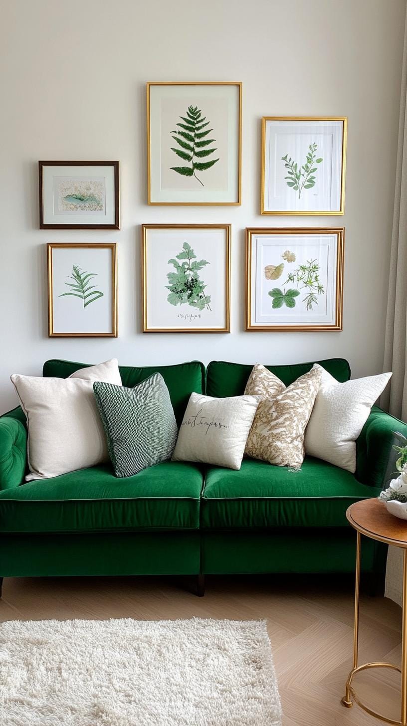
Imagine a wall brought to life by crisp botanical prints in simple, earthy wood or shimmery gold frames. This style brightens any space and breathes in a sense of calm.
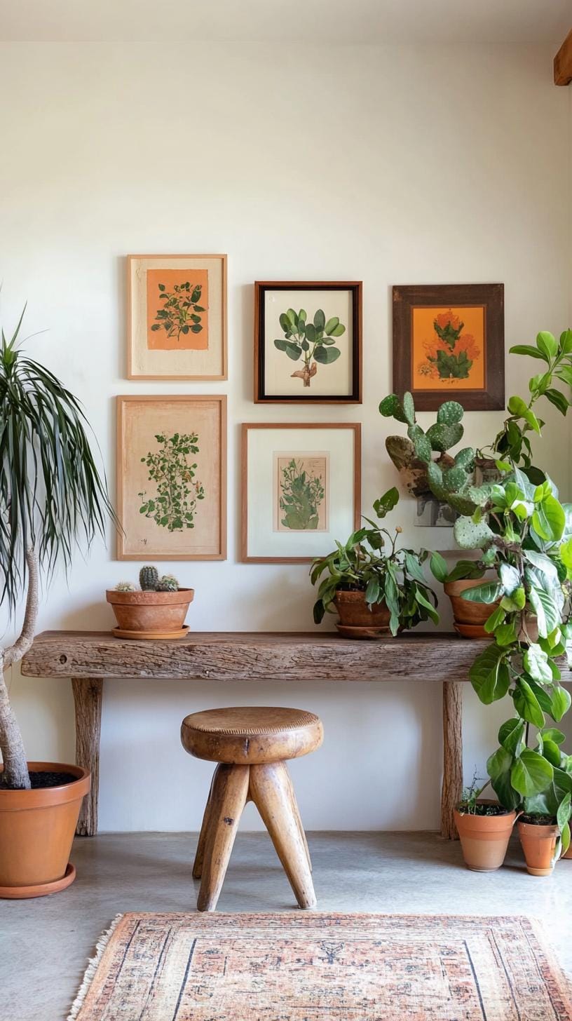
Botanical art next to textured wood seems to whisper, “Relax, you’re home,” perfect for entryways or reading corners.
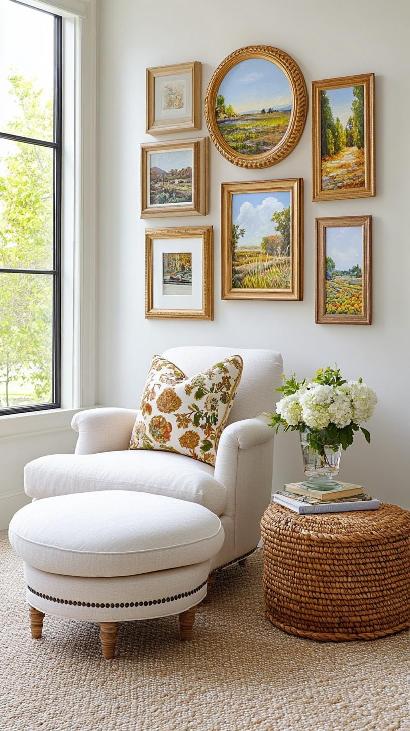
Hanging tip: try a grid of four or six prints, alternating frame materials. Keep spacing uniform, think of the satisfaction of a well-planted garden. The only risk? Overcrowding.
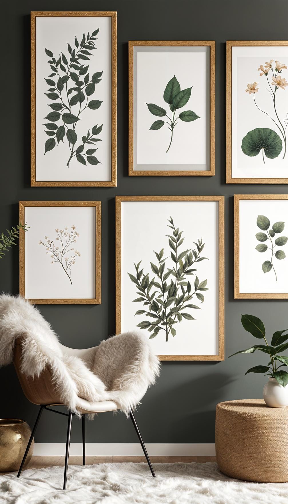
Stick with three to six pieces for real impact. Add a leafy houseplant nearby to seal the natural mood.
19. Oval and round frame mix using circular art forms layered for softness
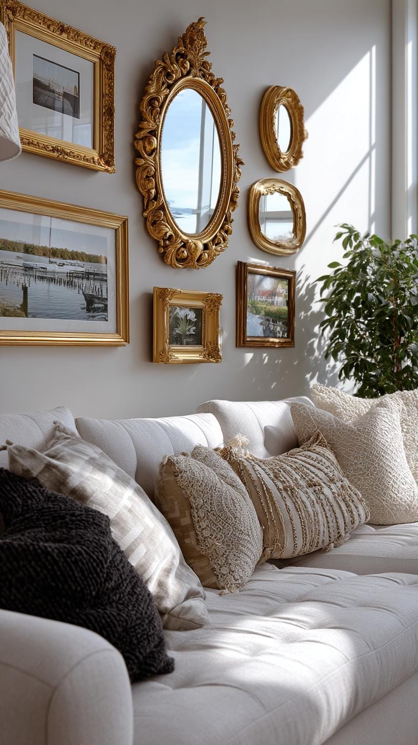
Mixing oval and round frames brings instant charm to any gallery wall. Circles soothe the eye, unlike sharp-edged rectangles. Just try arranging small, medium, and large frames in loose clusters.
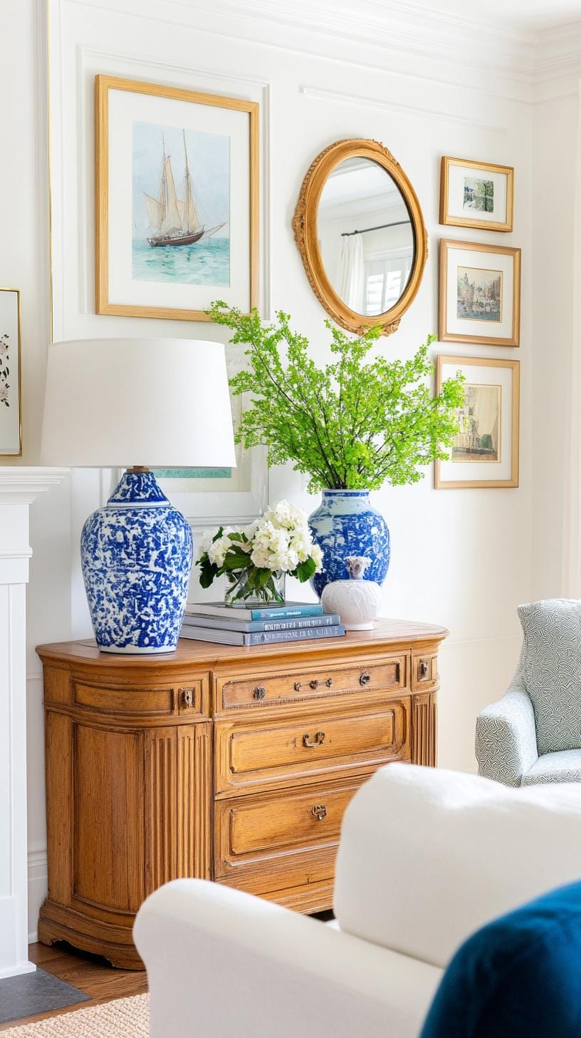
Add a layer of circular mirrors or embroidery hoops. Notice how the space feels gentler and more relaxed?
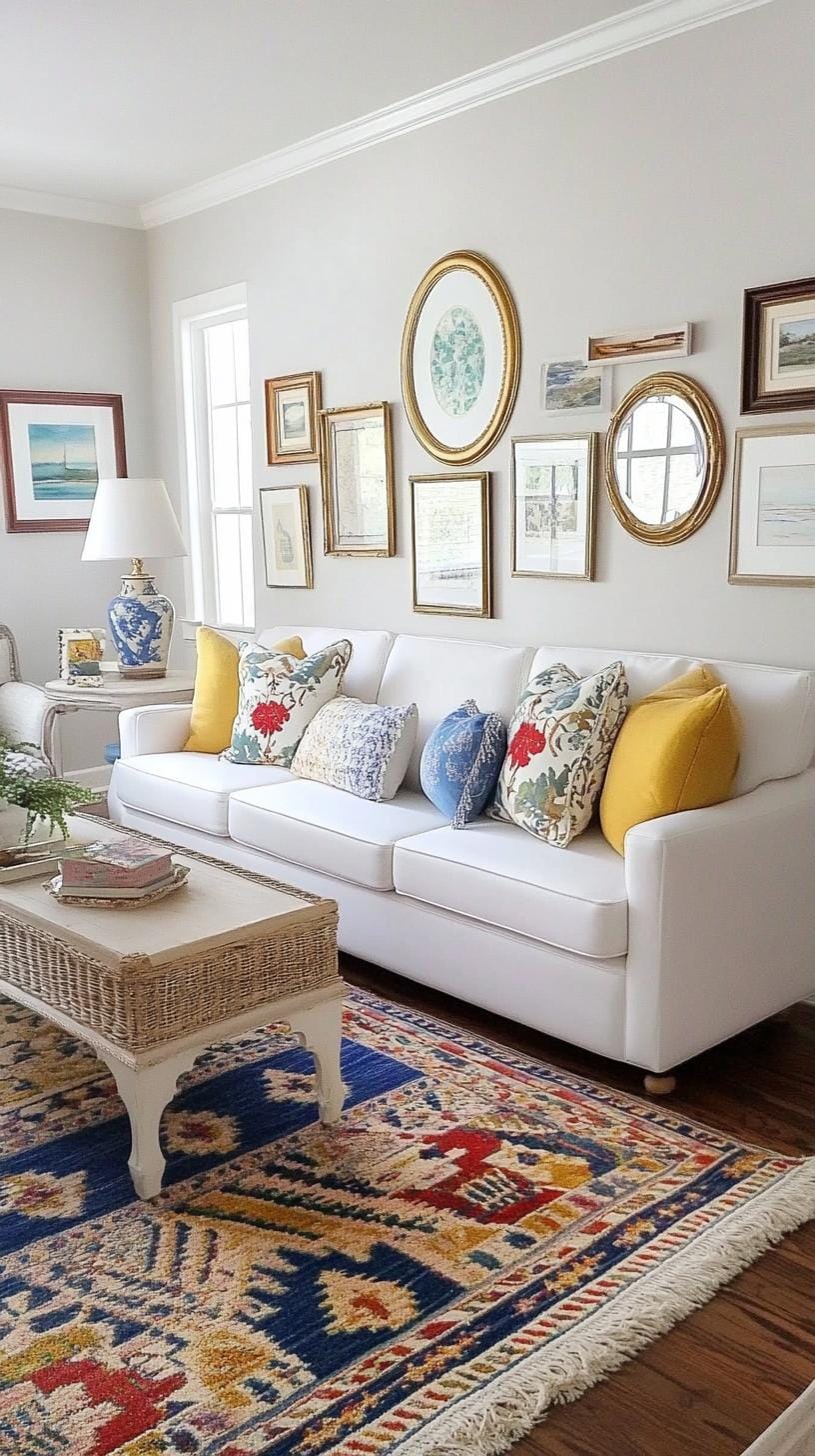
Artists and homeowners alike swear by this trick: layer two or three smaller circular prints over larger ovals. It takes the edge off stale, grid-style layouts.
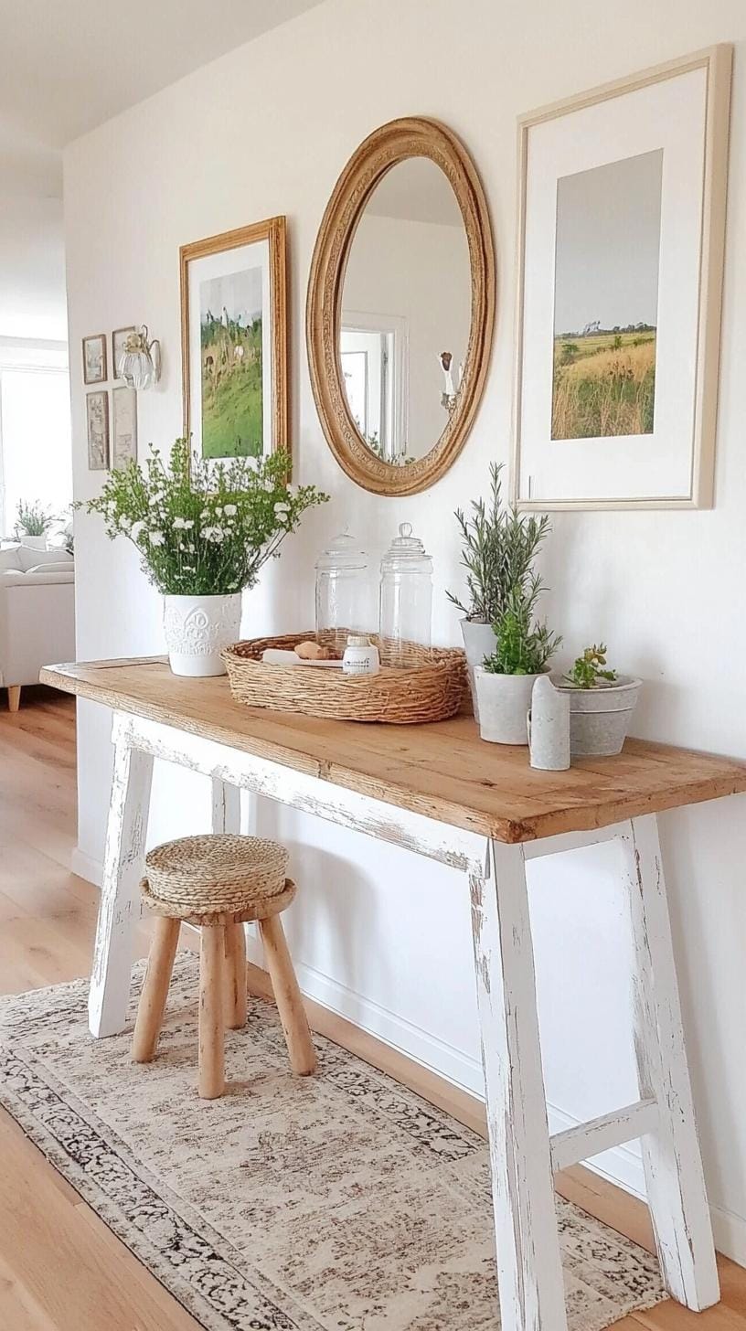
The only snag? It’s easy to overdo and lose balance, so space out each frame by a hand’s width for harmony.
20. Vintage mirror combo wall alternating mirrors with antique art prints
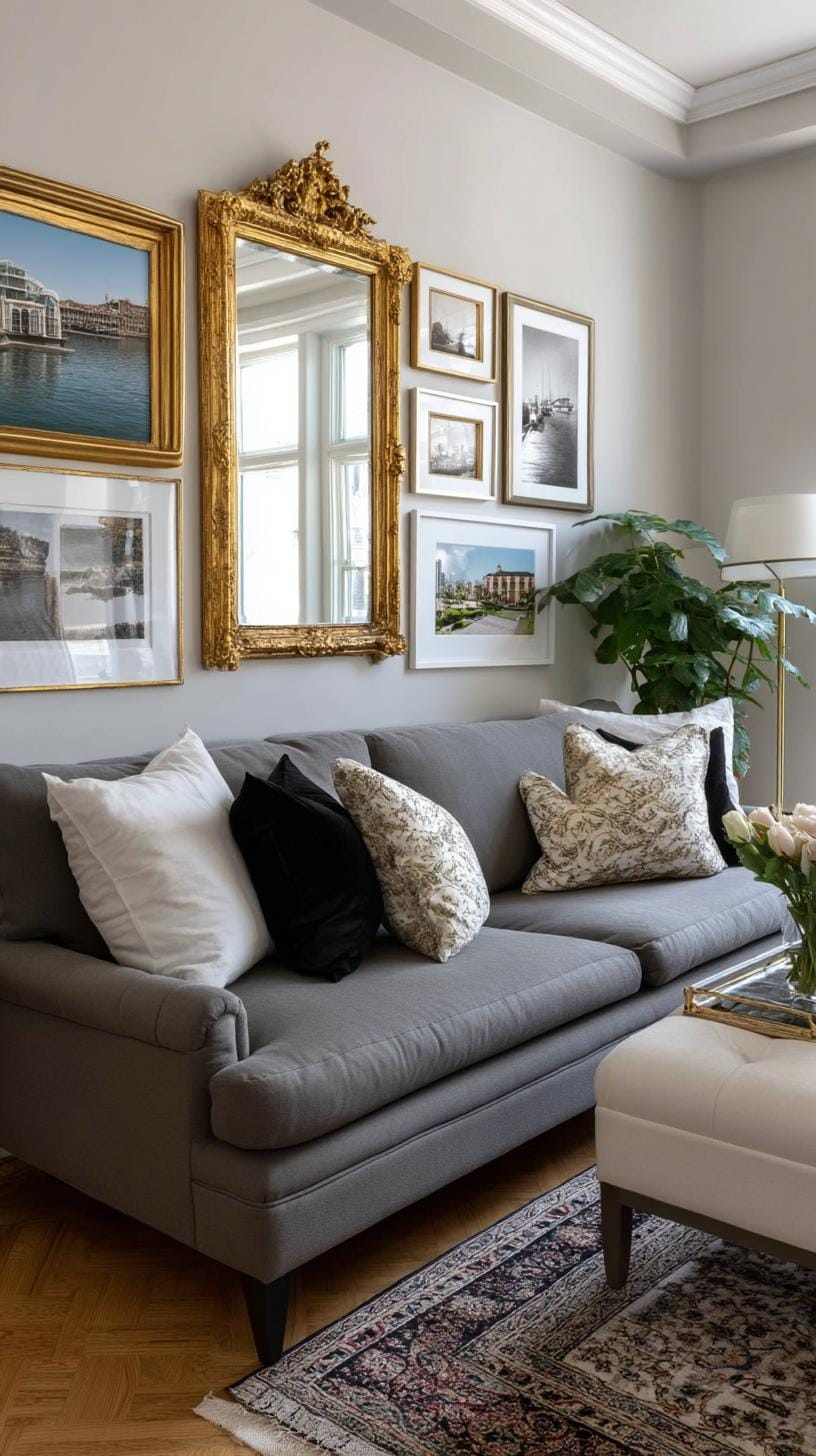
Stacking vintage mirrors with antique art prints creates instant visual drama. Try mixing round, oval, or ornate mirrors with small, timeworn paintings. Alternate placements, mirror, print, mirror, to break monotony.
Guests will ask if you hired a designer. But be cautious: too many shiny surfaces may overwhelm a small area.
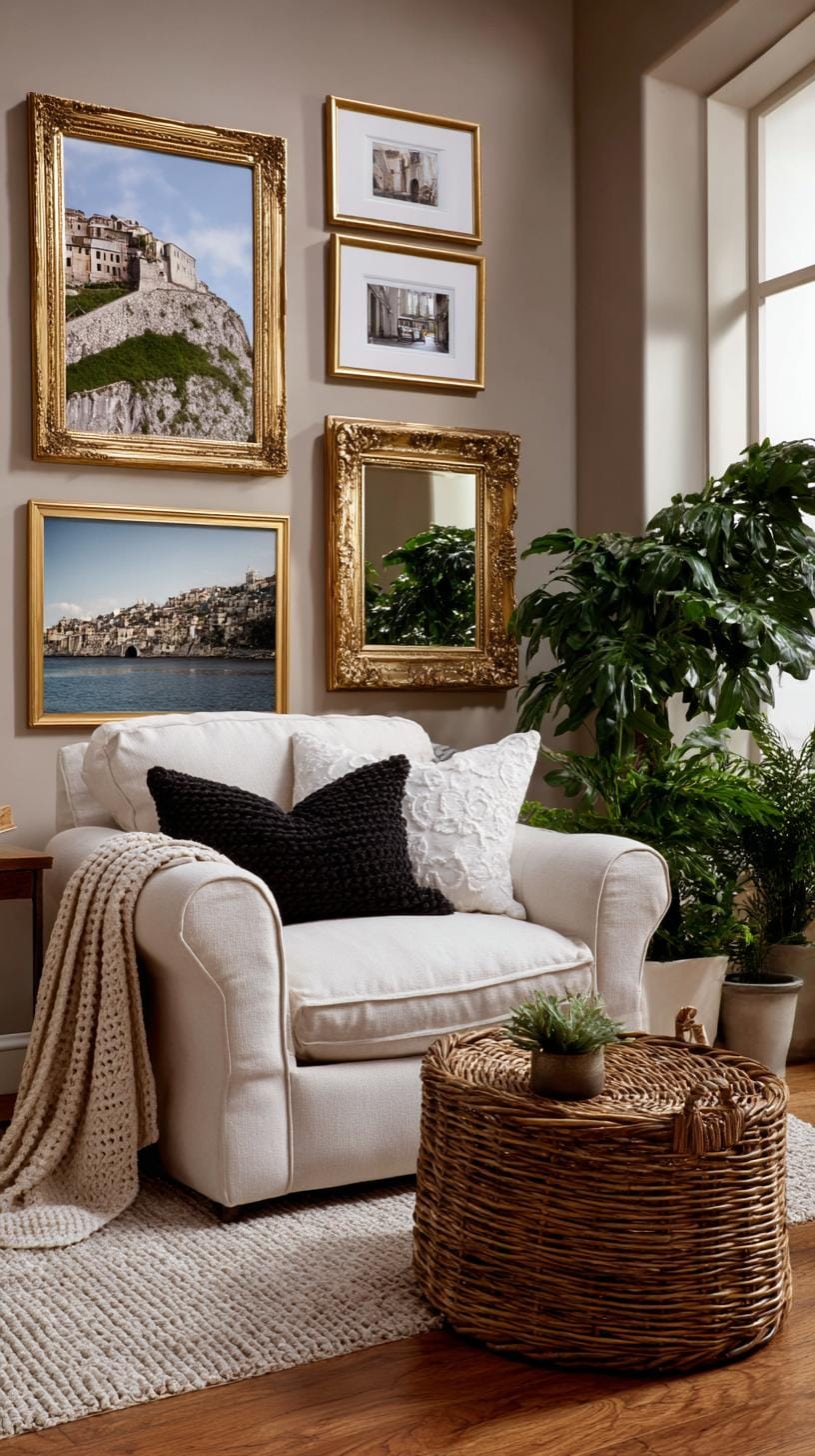
Finding balance is key. Test arrangements on the floor until you spot a repeating pattern that feels harmonious, not chaotic. For example, pair a heavily framed floral print between two lighter, gilded mirrors.
This style shines in entryways or dining rooms, catching light while sparking conversations.
21. Narrow hallway stripe wall with a linear stripe of small vertical frames
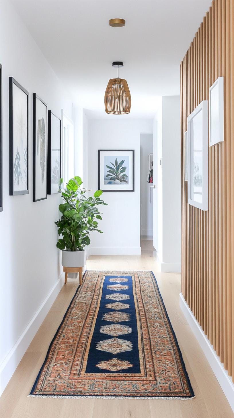
Walking down a narrow hallway can feel like strolling through a shoebox. Hang a crisp row of small, vertical frames in a single stripe to create energy and forward motion.
Your eyes move along the line, making the hall seem longer and more dynamic, even on a shoestring budget.
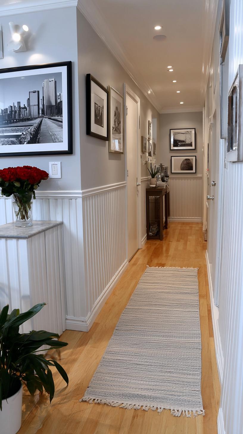
Choose frames with similar finishes for a clean look, or mix styles for added character. Stick with simple images like black-and-white photos or botanical sketches to avoid visual clutter.
This strategy keeps the space lively without feeling cramped, but be mindful, busy or oversized art can overwhelm slim corridors.
22. Rustic wooden frame cluster using natural wood finishes with outdoorsy themes
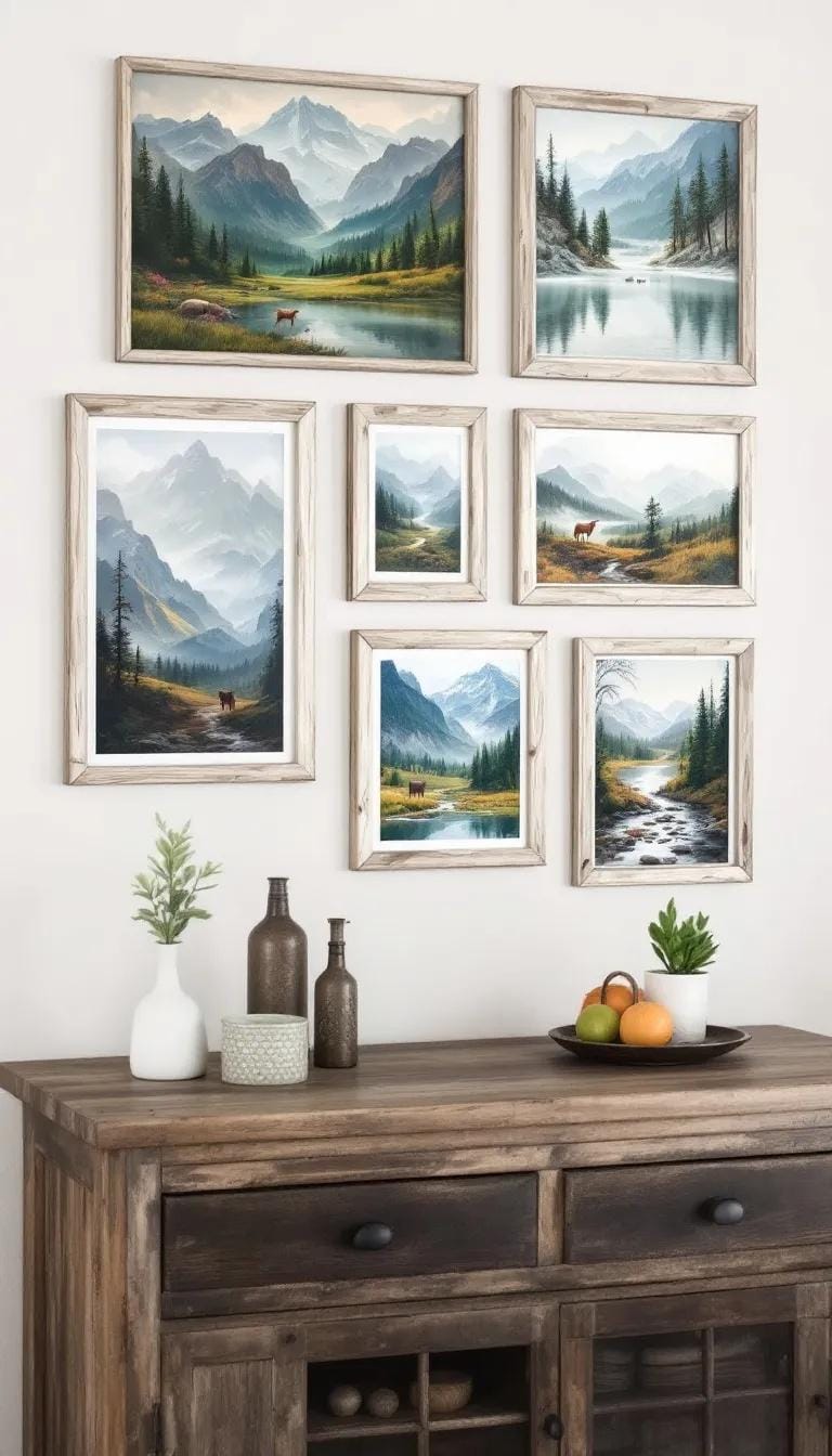
Ever tried grouping wooden frames with knots and visible grain? Rustic clusters bring warmth, character, and an outdoorsy air to any room. Arrange mismatched frames tightly or loosely.
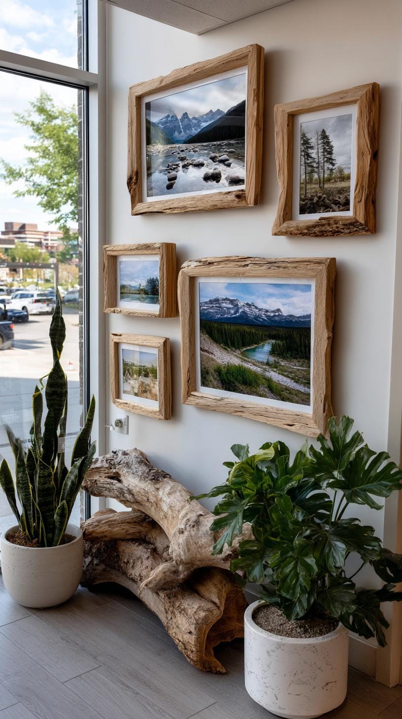
Include nature prints, pressed leaves, or even hiking snapshots. Think “cabin meets gallery”, cozy but far from fussy.
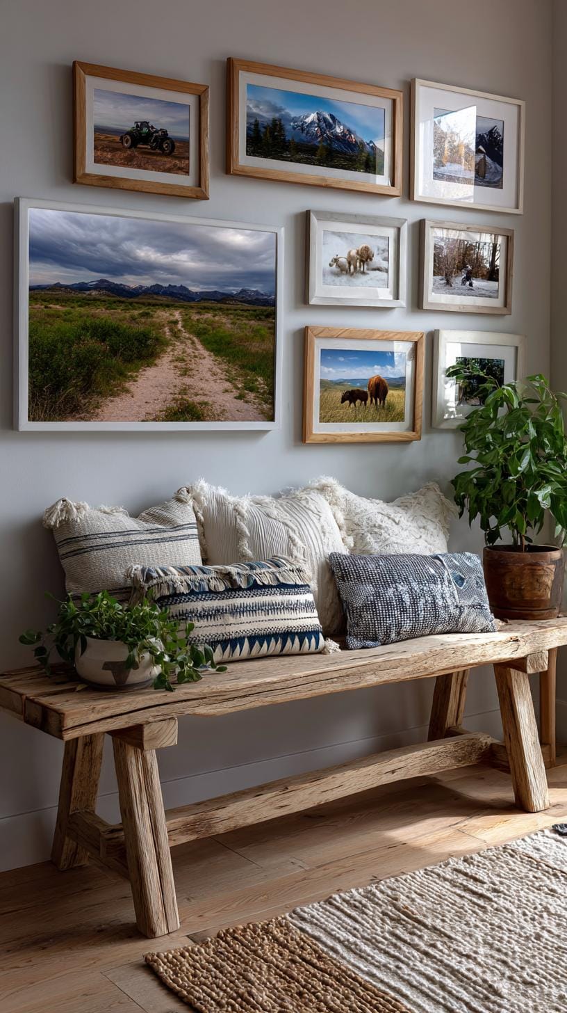
Mix frame thickness and shades, walnut, pine, and reclaimed wood, for added depth. Keep it fresh by swapping in new photos from your latest adventure.
Yet, beware: too many similar tones may blend together. Avoid monotony by breaking up wood with splashes of green foliage or metallic accents.
23. Polaroid style mini grid with small photos tightly spaced in rows
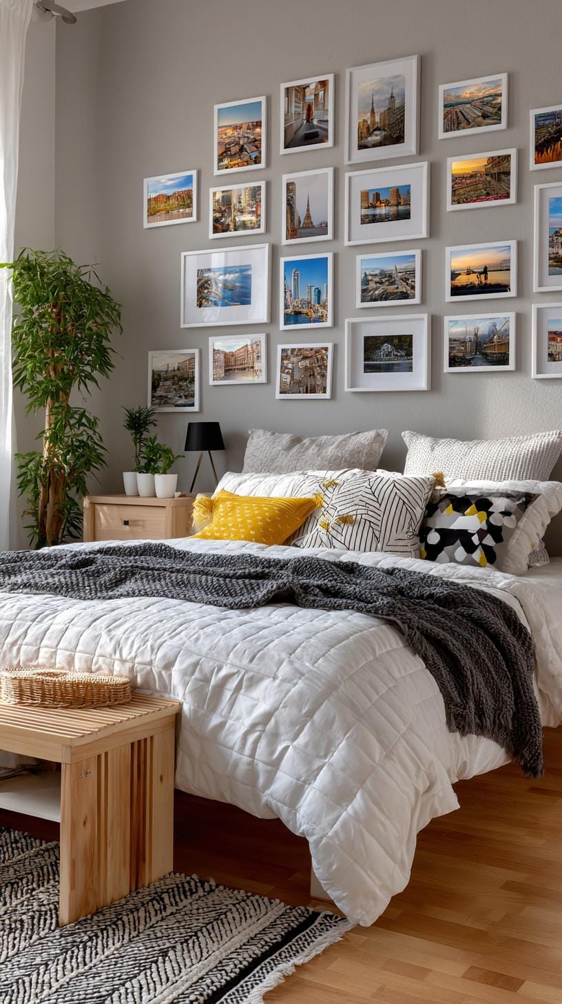
Some people hang big art because it looks posh. But small, tightly packed Polaroid grids say something different: fun, nostalgia, imperfection.
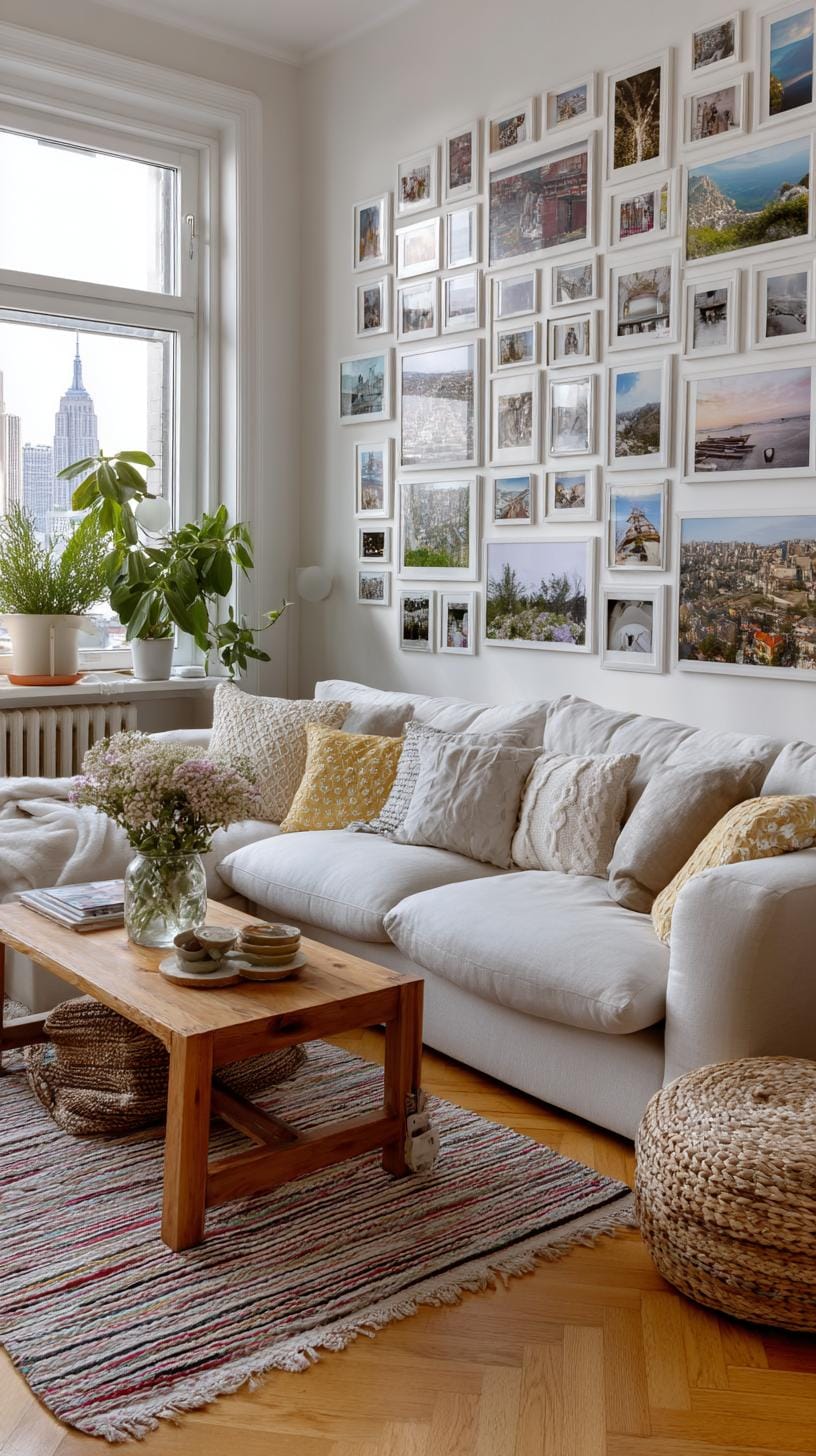
Arranging mini prints in even rows is simple, use double-sided tape or removable putty for easy adjustment. This lets you refresh photos as your mood changes.
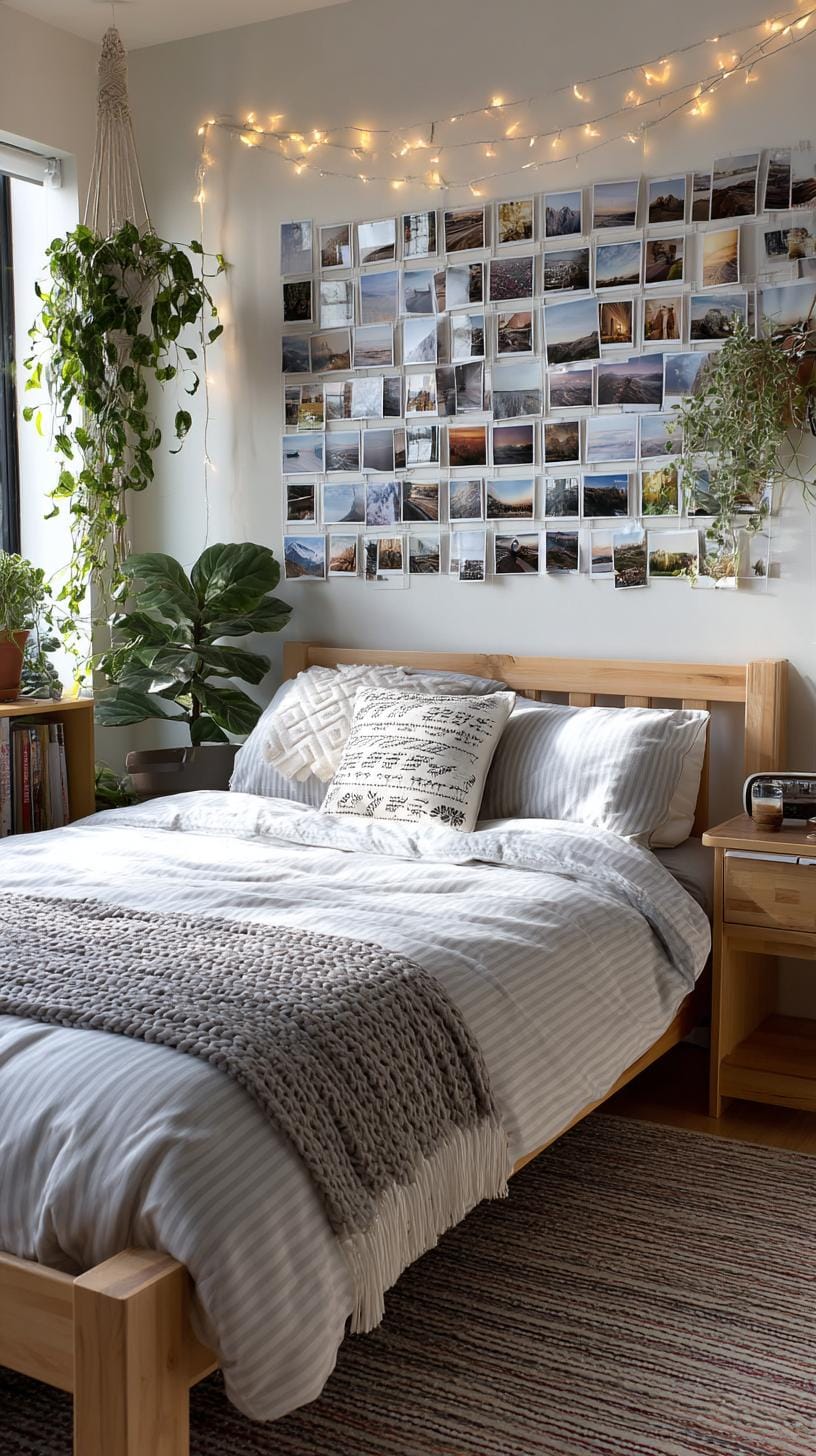
A wall covered in these little memories becomes a conversation starter. Friends spot themselves in old party shots or candid selfies. No waiting for custom frames or matching mats.
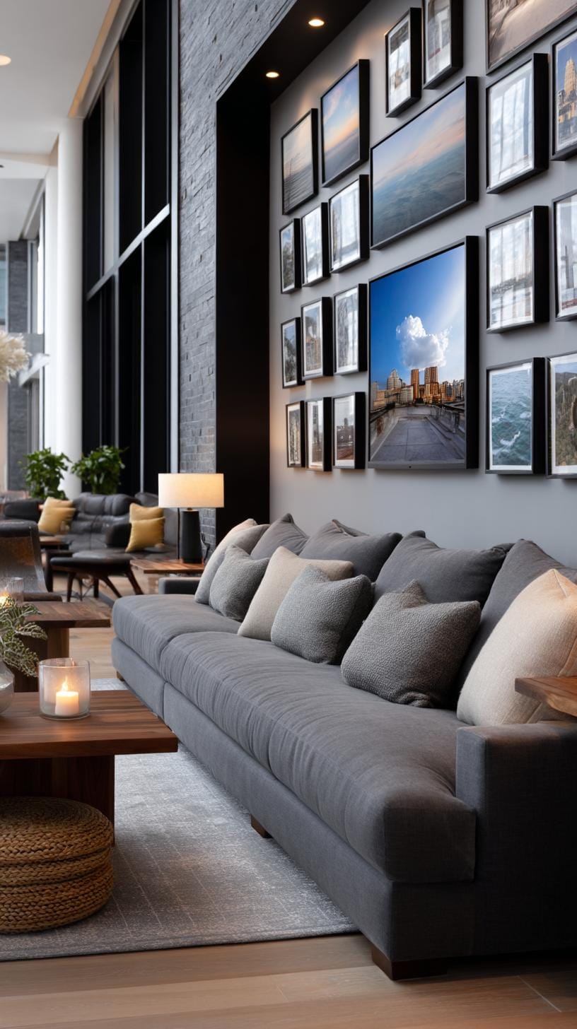
The main hitch? Dust collects in the tight spaces, so a quick swipe with a duster now and then helps keep things fresh.
24. Floating frame wall made of transparent or acrylic frames with space around them
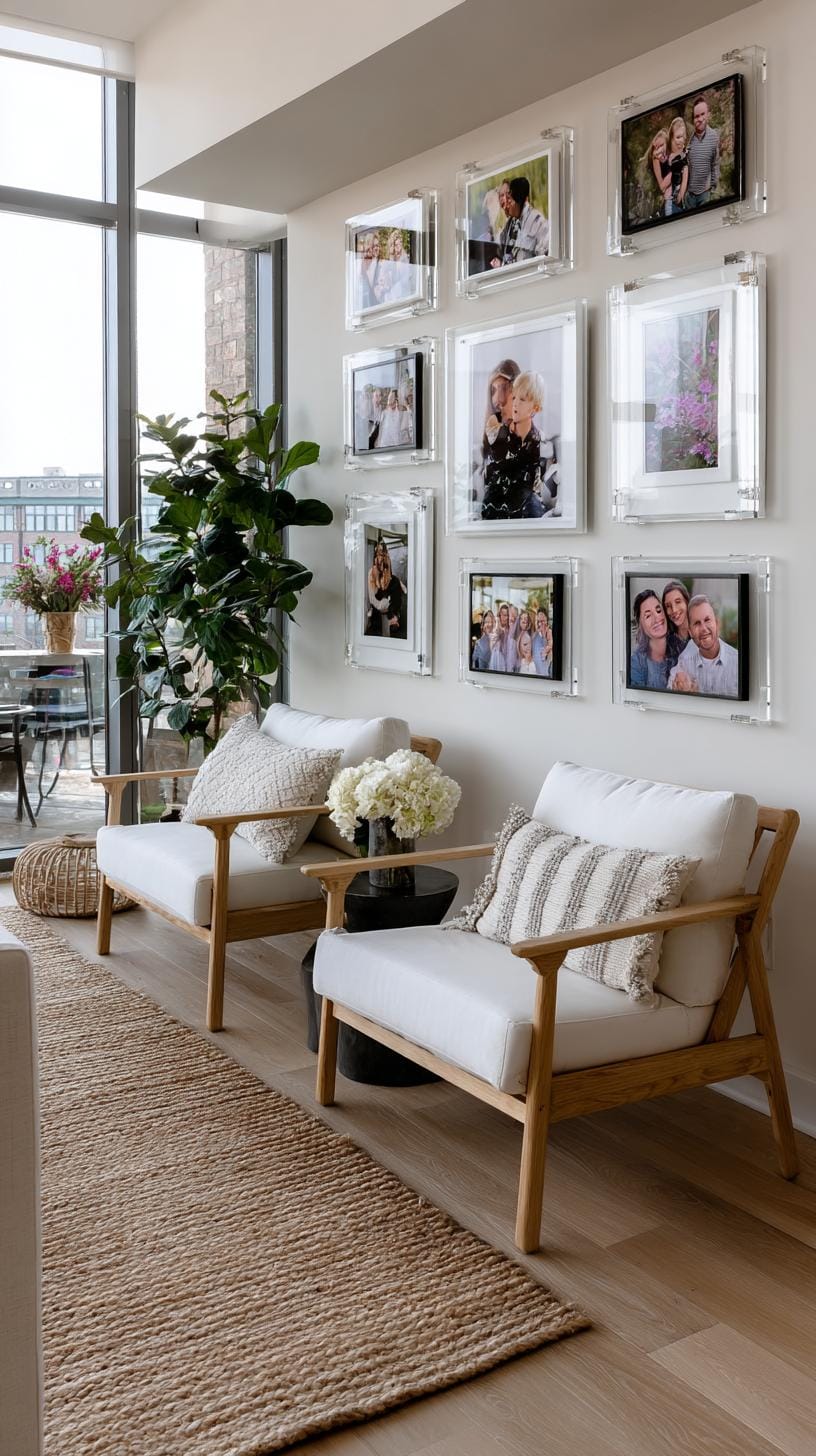
Imagine an arrangement of clear acrylic frames, each appearing to float away from the wall. This method brings breathing room between cherished memories.
The transparent borders create visual lightness, perfect for modern or tight spaces. Think of it as giving your images their own stage without crowding the scene.
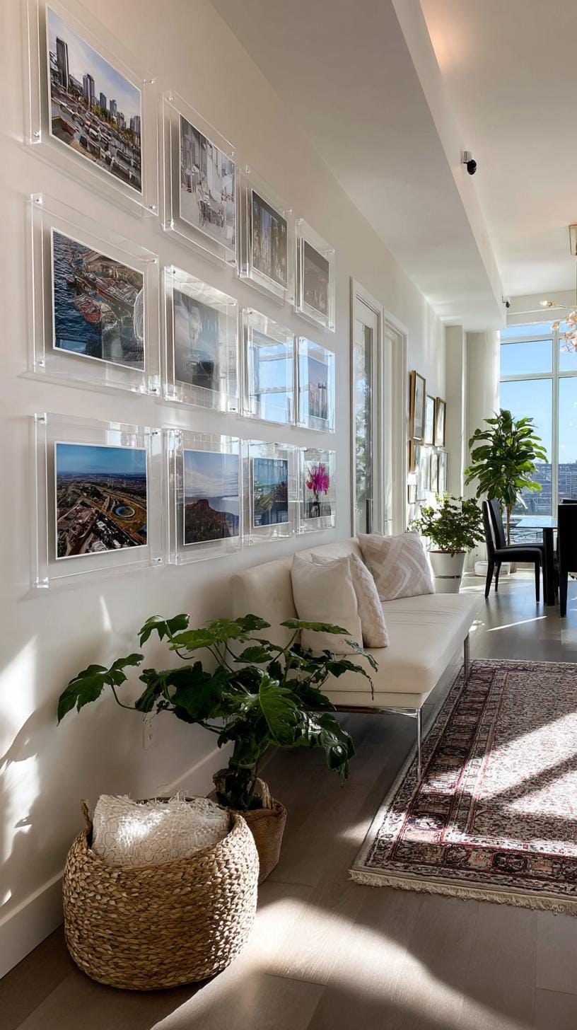
What’s the catch? Fingerprints show up quickly, and acrylic can scratch if handled carelessly. Still, the effect is striking.
To keep the display cohesive, stick to photos with a unified color theme and consider spacing the frames evenly, three inches apart works wonders for most walls.
25. Rainbow color gradient layout arranged in spectrum from left to right
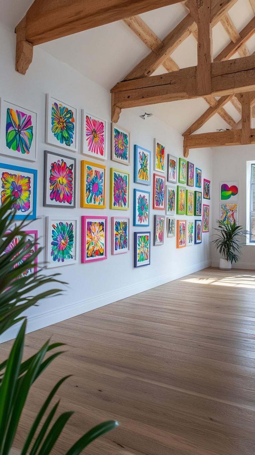
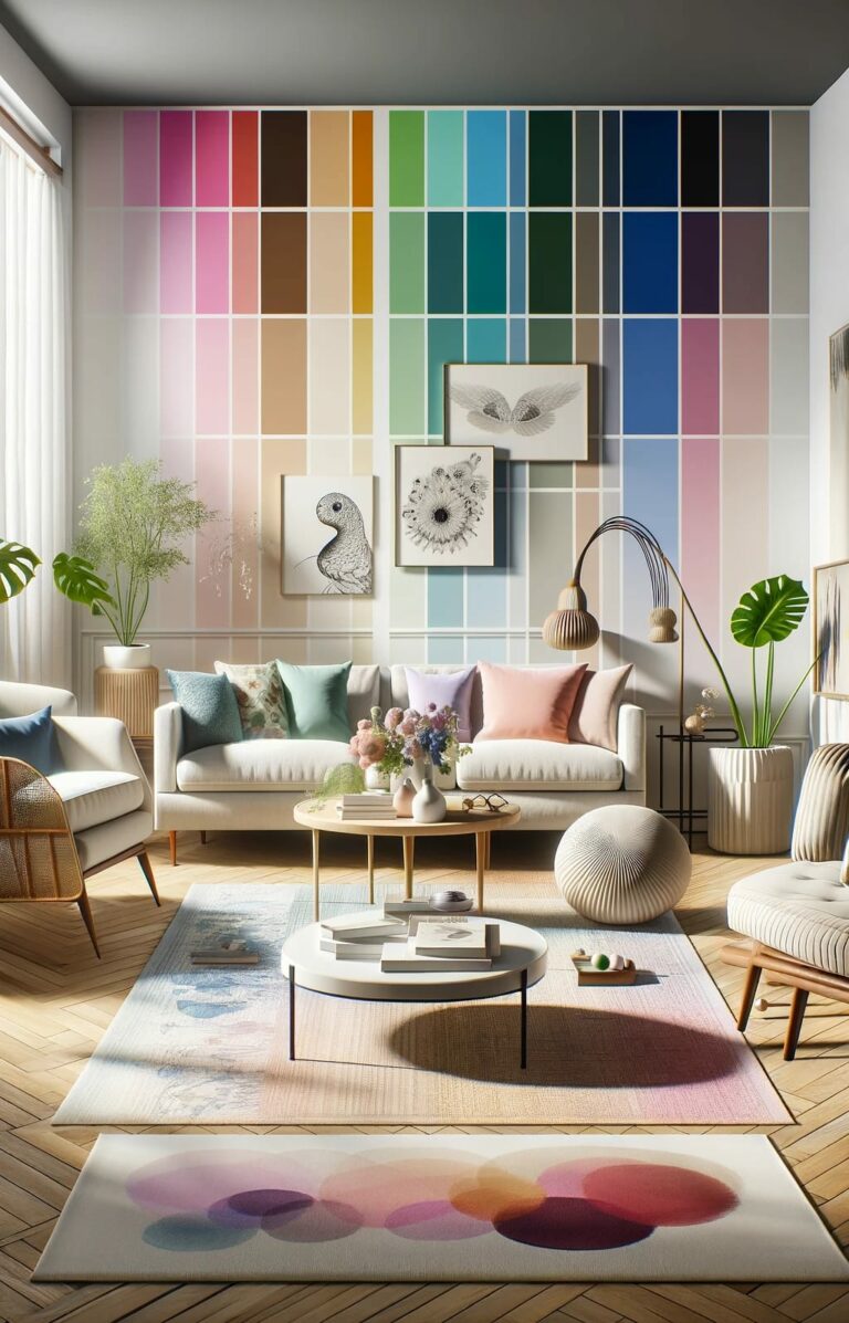
Grouping artwork in a rainbow color gradient feels playful yet tidy. Imagine a series of art prints shifting smoothly from vivid reds at the left edge to cool violets on the right.
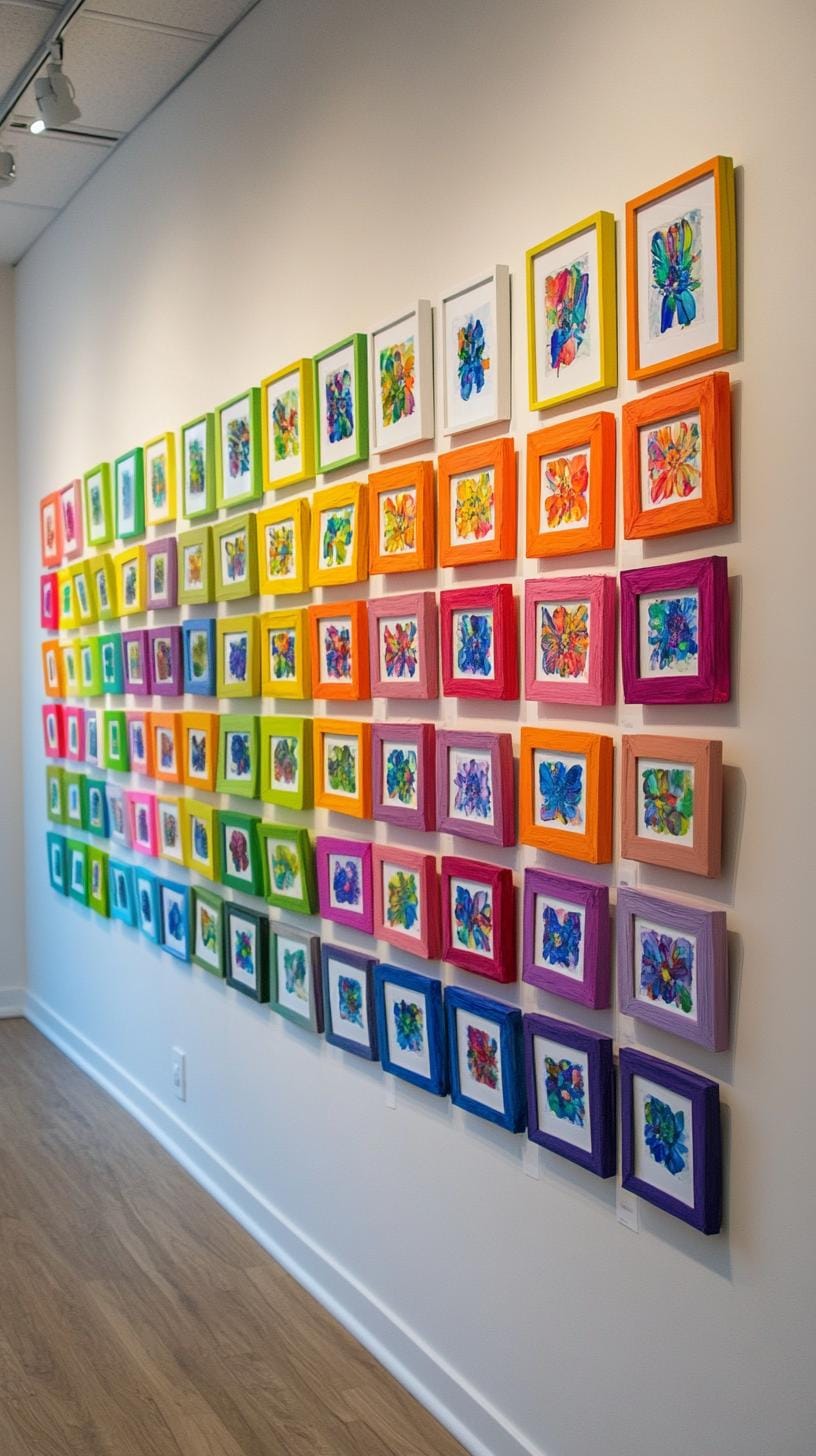
This method draws the eye naturally, creating cohesion out of different styles or frame shapes.
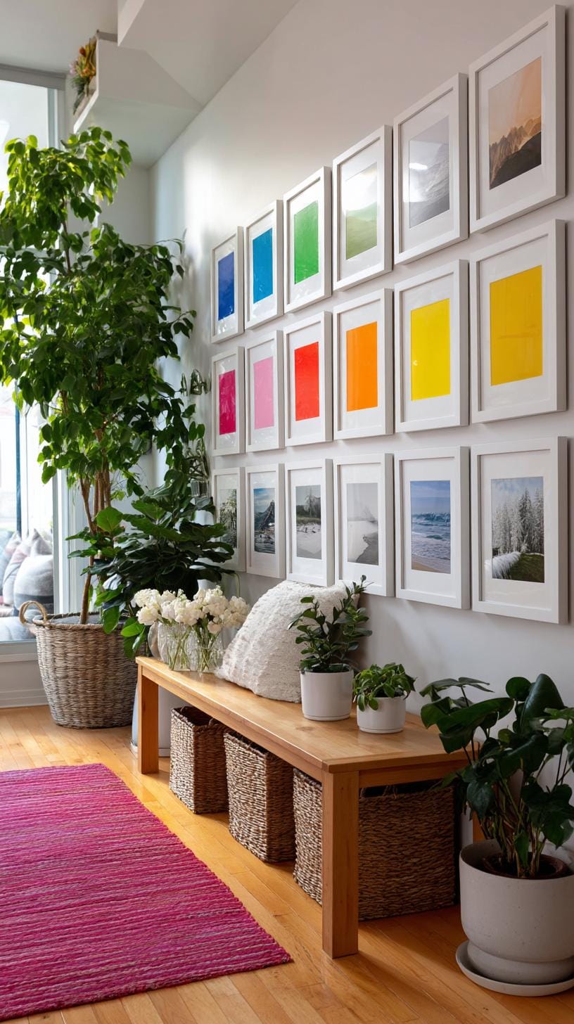
Don’t have a lot of color variety? Start with colored mats, smaller prints, or even fabric swatches to fill gaps. The downside, finding art in every distinct hue takes time and persistence.
Still, visitors will remember your wall. One look often sparks cheerful conversation.
26. Shelf integrated art wall with art displayed within and around open shelving
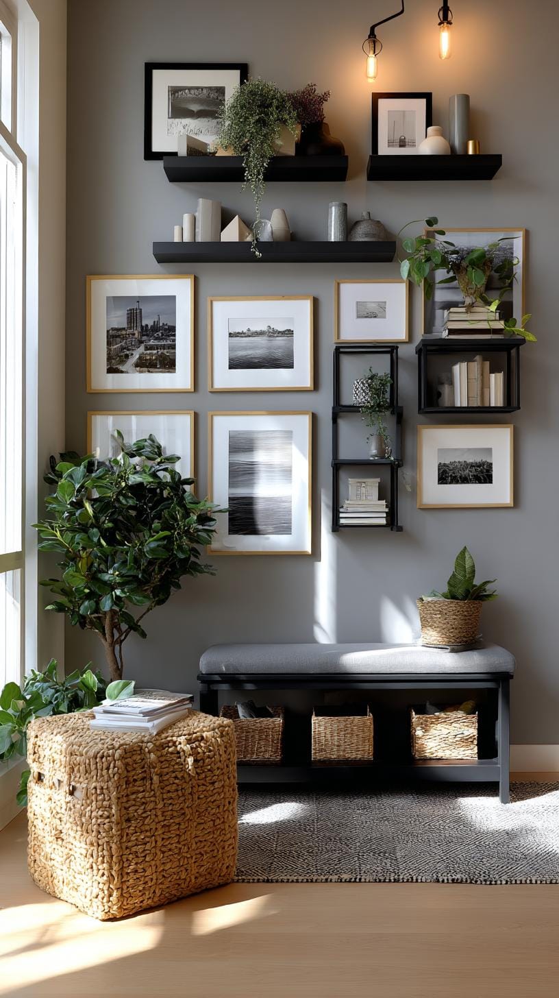
Shelves don’t just hold books, they create a dynamic frame for your artwork. Place bold prints right on a shelf, or let small sculptures sit among vases and plants.
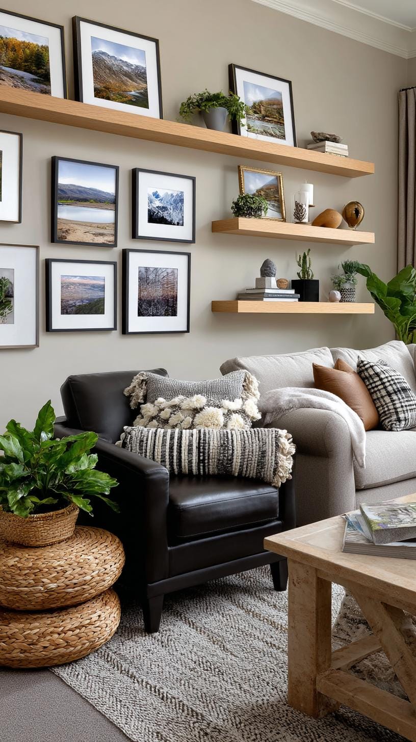
Even postcards can get their moment in the spotlight this way. Mixing objects and art keeps the eye engaged, almost like a visual scavenger hunt.
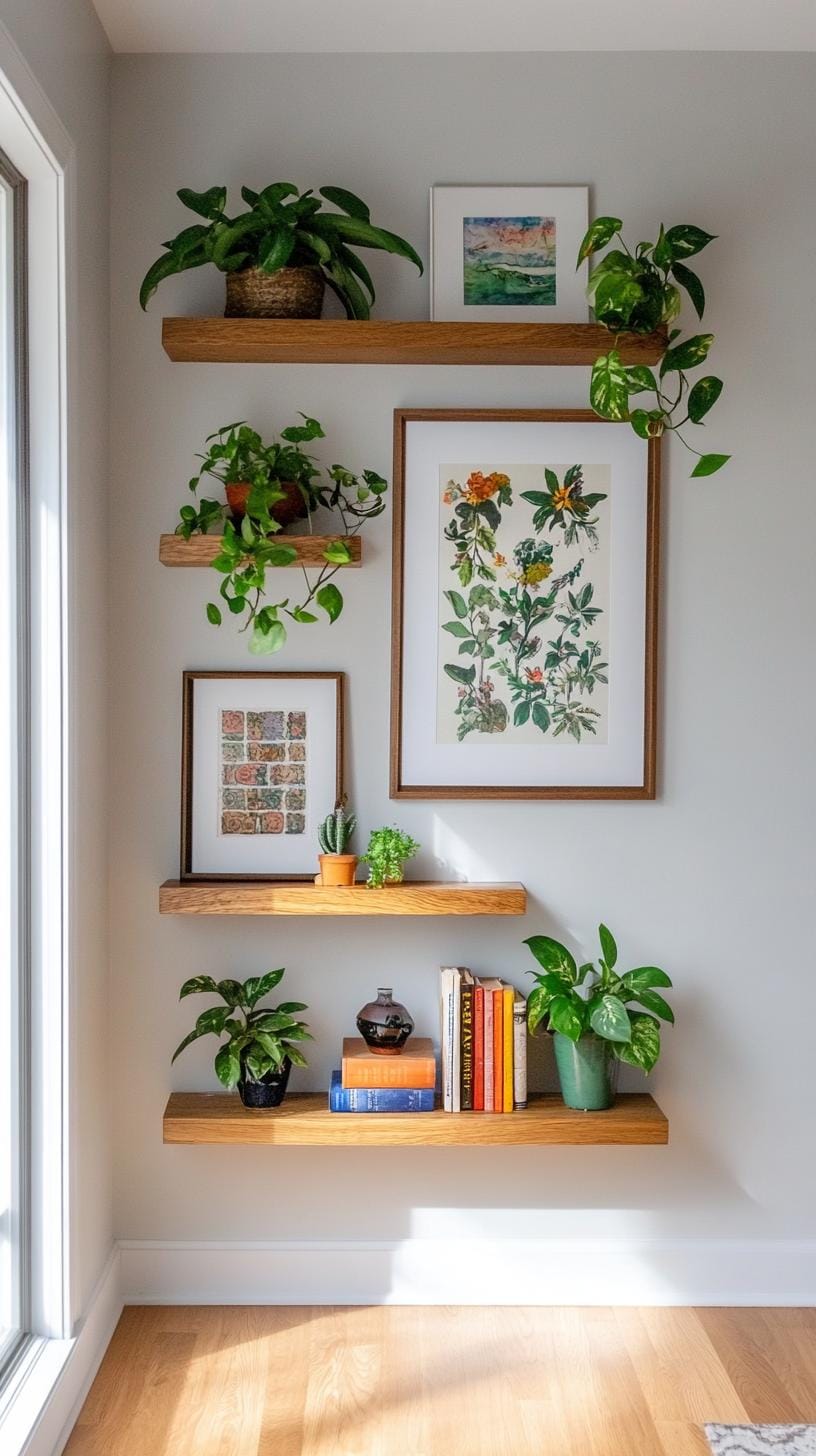
Balance and playfulness matter here. Avoid stuffing every inch; let some shelves breathe. Try shifting a framed piece off-center, or stagger heights for energy.
This style cheers up renters too, no need for a hundred nails. The downside? Dusting can get tedious, but a striking, ever-evolving display often makes up for it.
27. Record cover gallery made from framed vintage LP covers with bold graphics
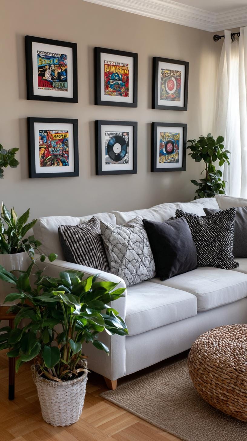
Try arranging framed vintage LP covers in a grid pattern for major impact. Bold, graphic album art instantly draws the eye and turns your wall into a conversation starter.
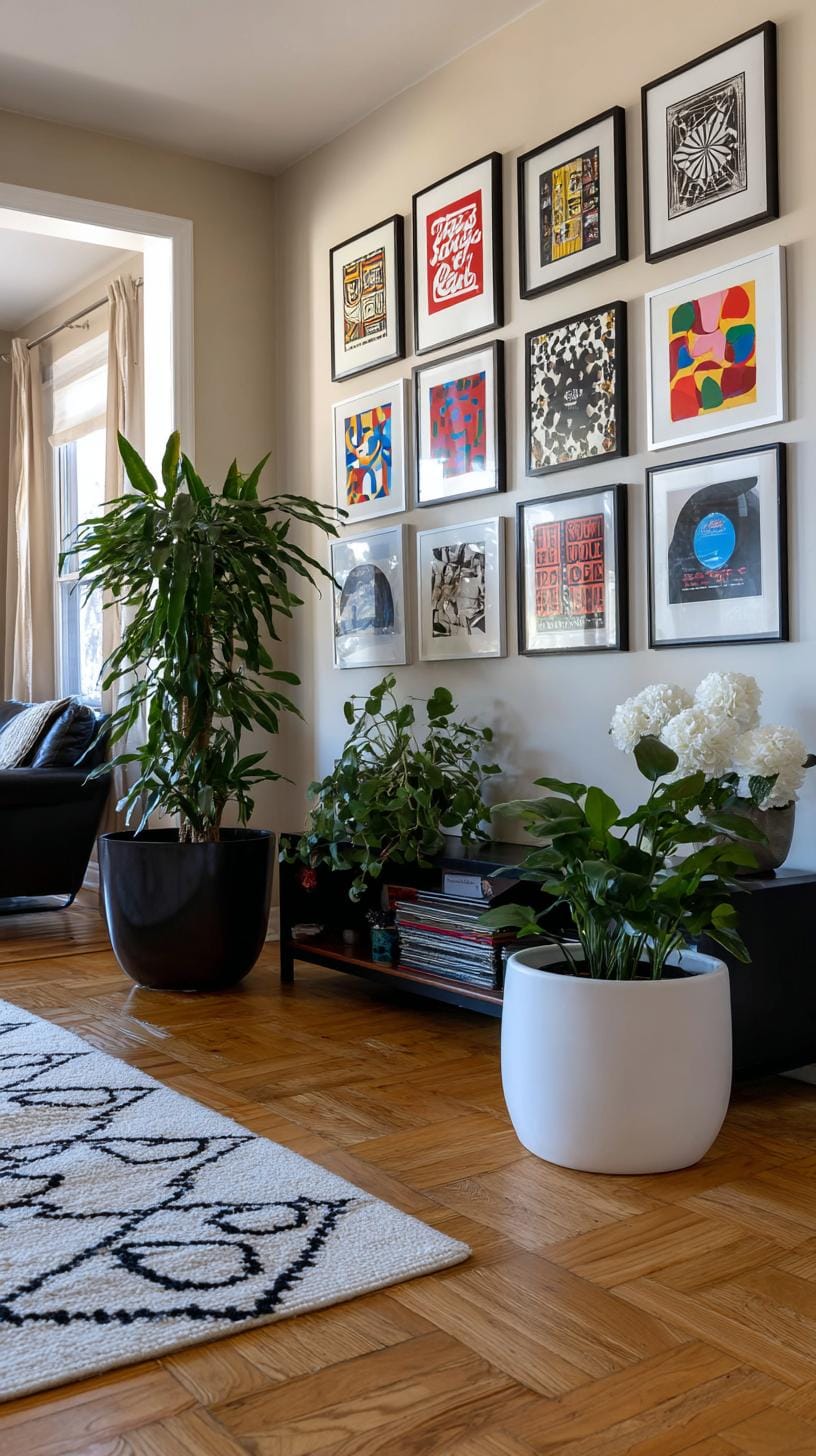
Don’t rush matching frames perfectly, slight variations can add charm. Got an old Hendrix or Beatles classic? Show it off, flaws and all.
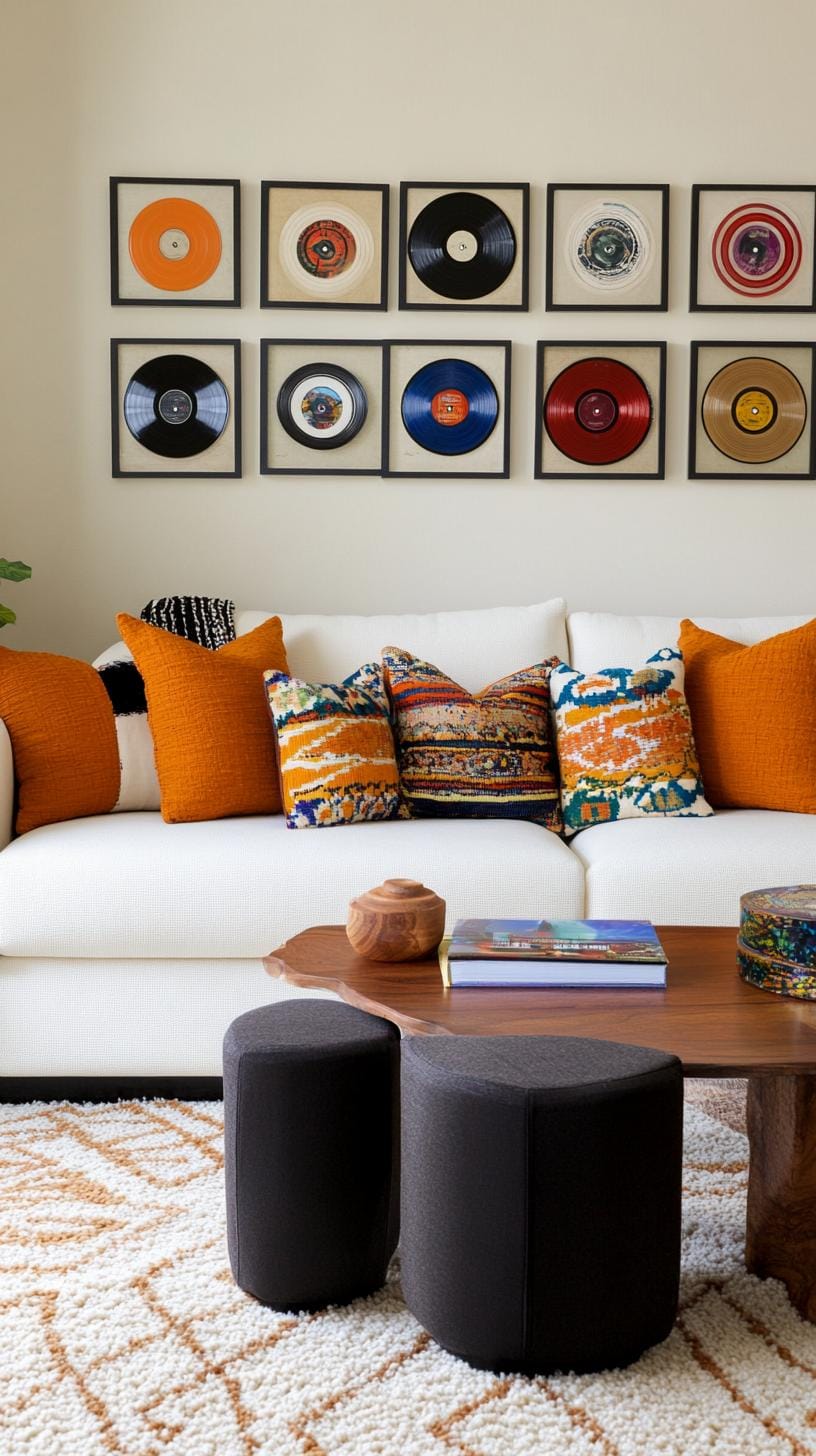
Mix genres if you like surprises, or stick to jazz or rock for strong visual unity. The main pitfall? Sunlight. Vintage covers fade, so avoid direct light.
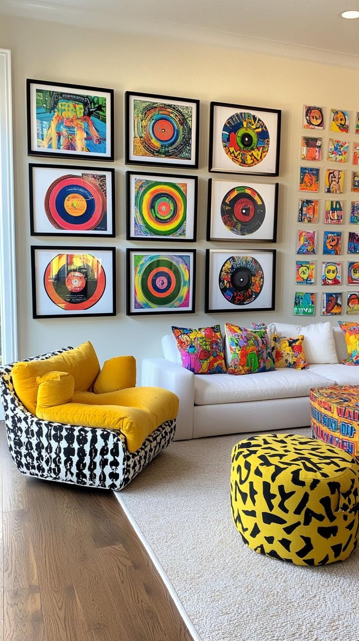
Friends might joke you’re stuck in the ’70s, but who wouldn’t love a wall that rocks harder than their playlist?
28. Art and quote typography mix where graphic quotes are interspersed with visuals
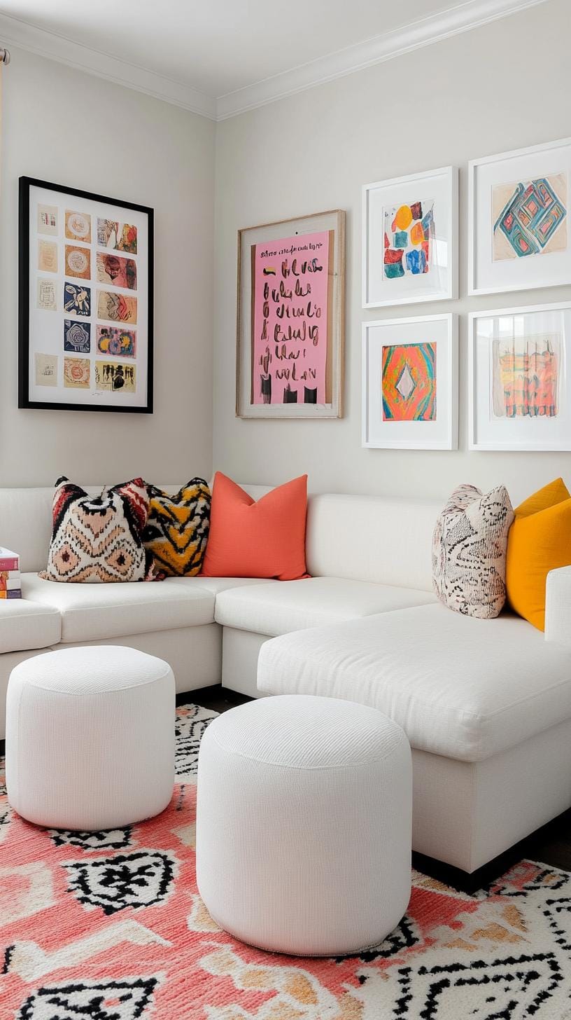
Mixing art and quote typography on a gallery wall sparks energy in any living space. A black-and-white typographic print beside a neon abstract piece grabs attention. This approach breaks monotony.
Want inspiration? Pairing a vintage travel poster with a “Stay Curious” quote instantly starts conversations.
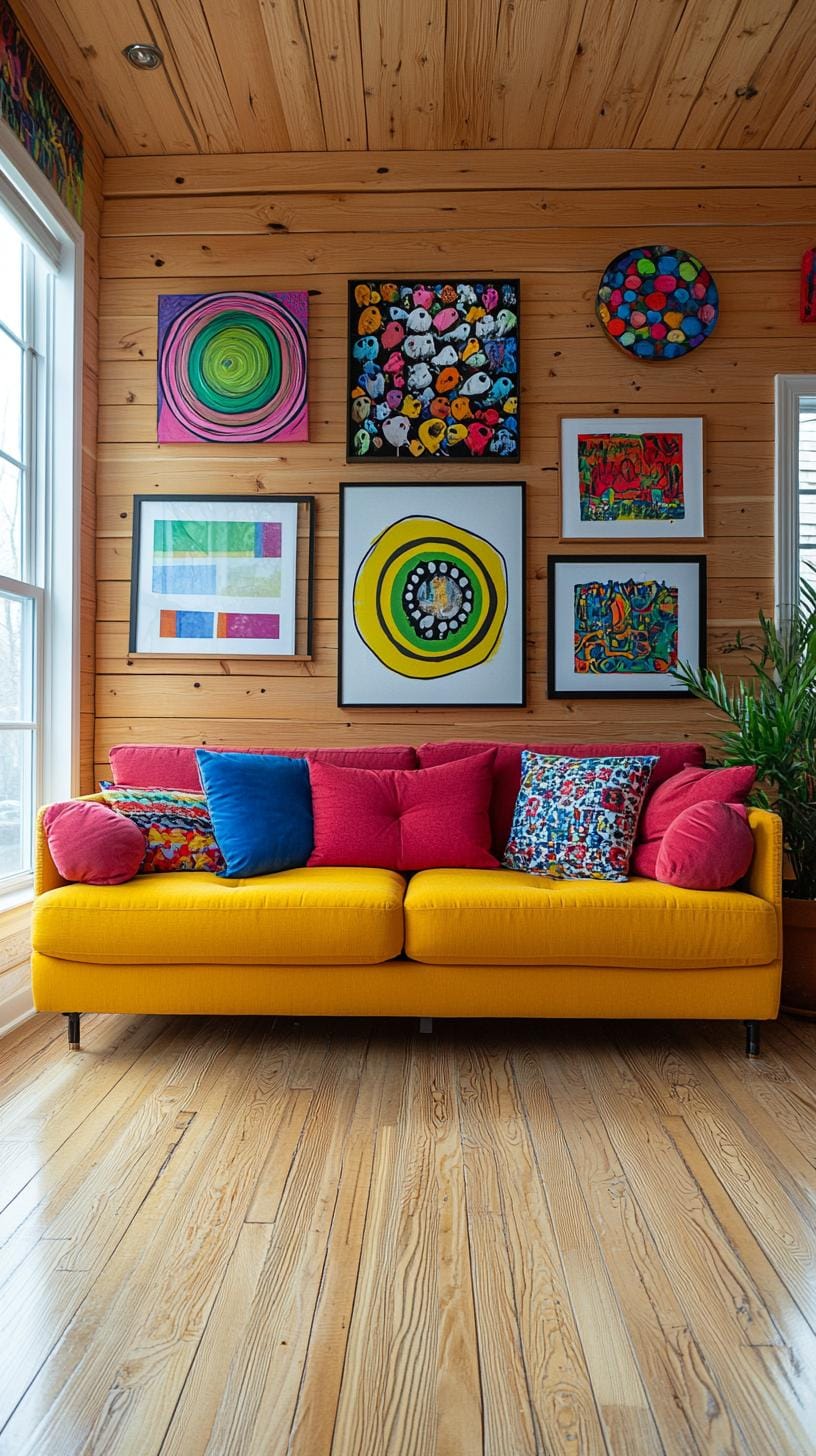
Don’t overstuff the arrangement. Let bold words breathe alongside striking visuals. For example, hang a minimalist “Dream Bigger” print near a colorful landscape. The contrast creates both rhythm and focus.
Remember, too many wild fonts can look messy, choose two that sing together instead of shouting over each other.
29. Kids art creative wall showcasing children’s drawings in a playful formation
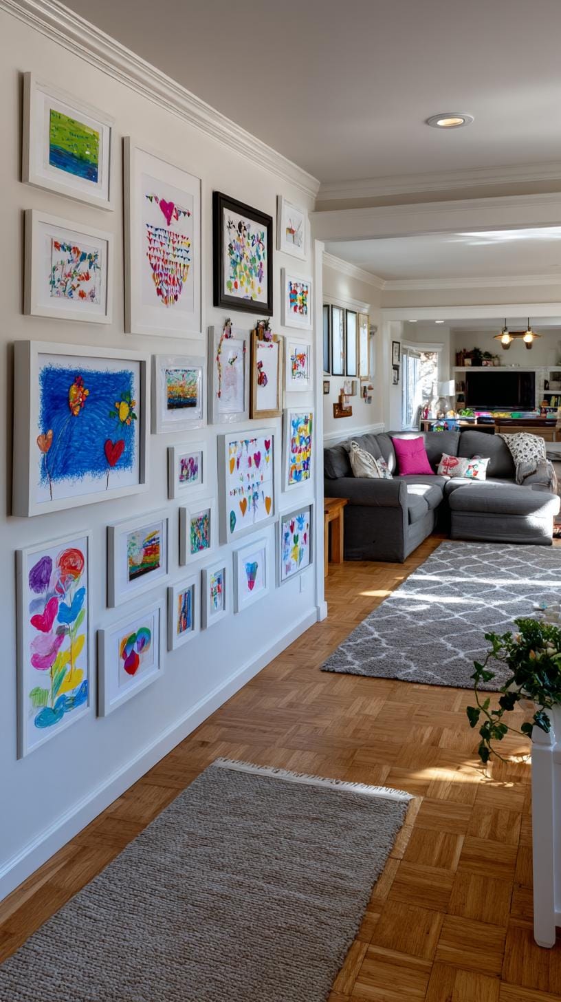
Imagine a living room wall dotted with colorful frames, each featuring a child’s bold crayon creatures. Group drawings of the same theme together, think dinosaurs on one line, flowers on another.
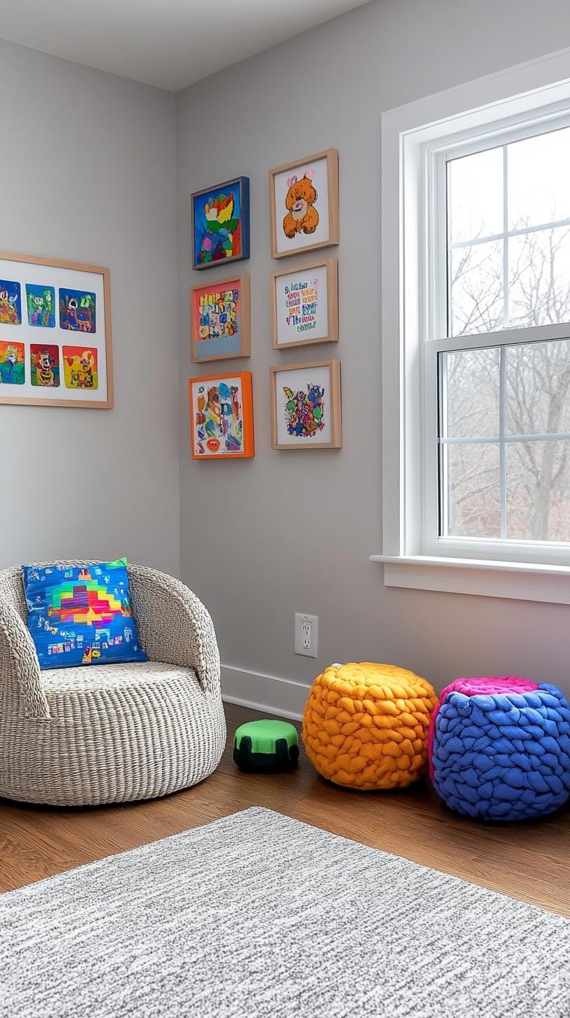
This playful order sparks conversation and treats each doodle like the masterpiece it is. Let them help arrange it!
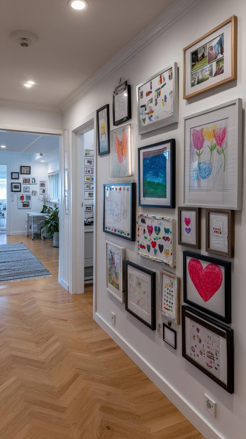
Some parents stress about matching frames or perfect symmetry, but flexibility is key here. Mix clips, washi tape, and quirky frames for variety.
Hang artwork at your child’s eye level so pride beams in their smile. Rotation is simple, just swap creations as new art piles in. This setup grows with them.
30. Black accent wall contrast using light frames and art on a dark painted wall
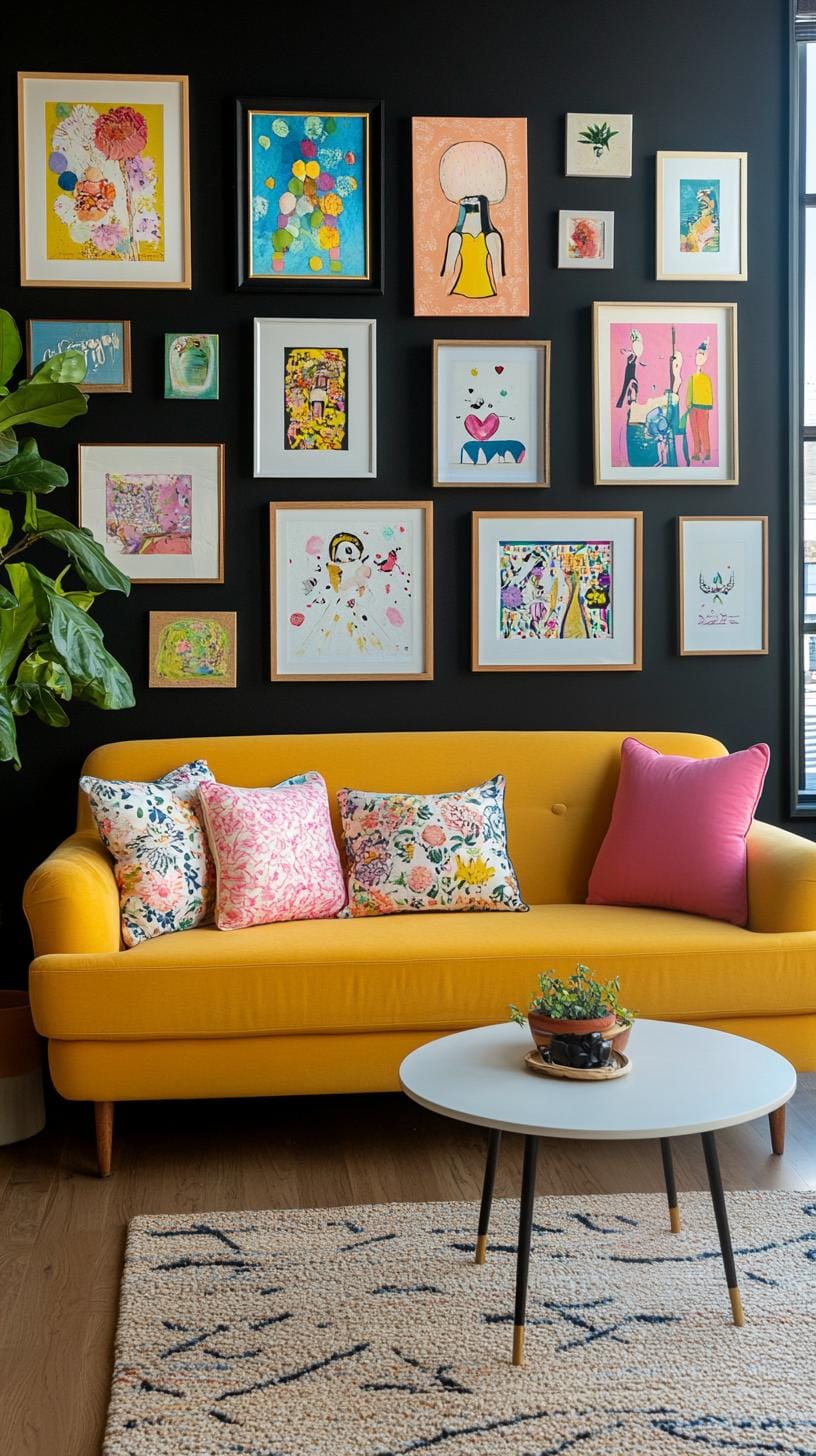
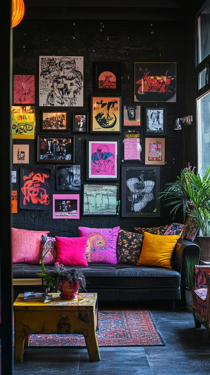
Painting one wall black is a bold choice, but it pays off with the right approach. Light-colored frames, think white, pale wood, or gold, pop dramatically against a dark background.
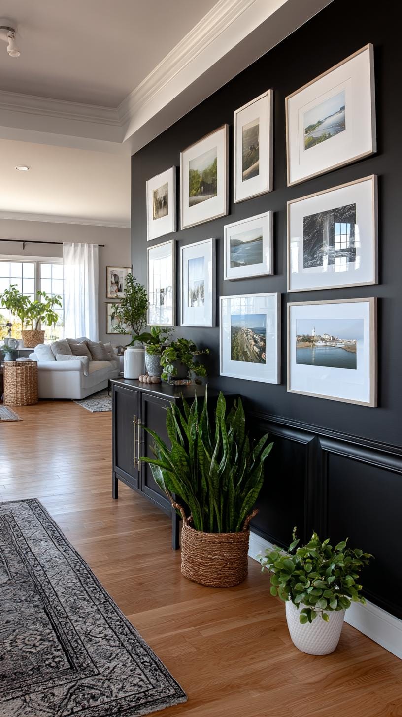
Consider hanging simple line drawings, pastel prints, or black-and-white photos for maximum effect. It’s modern, but never feels cold.
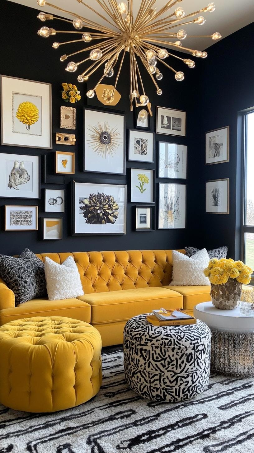
Use symmetry or loose grids for a more deliberate look. For renters, removable picture-hanging strips keep both landlord and layout happy.
One trade-off: dust shows up easily on black walls, so keep a duster handy. Still, the moody, gallery-inspired effect is worth that minor upkeep.
31. Gold gilded classic layout with ornate frames and symmetrical spacing
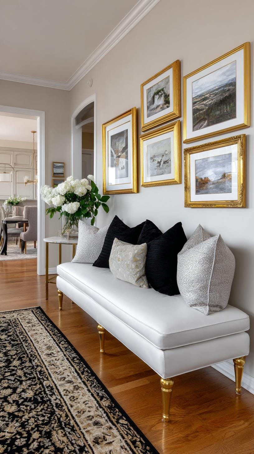
Ever notice how gold gilded frames pull a room together faster than you can say “luxury”? Place matching ornate frames in a classic grid pattern.
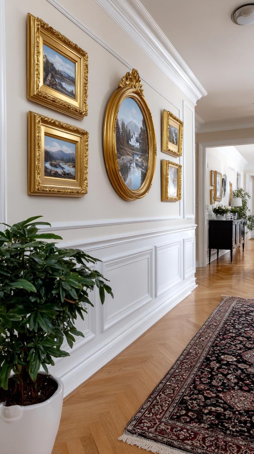
The deliberate symmetry calms the eye, while the ornate gold adds a sense of grandeur. This style shines in dining rooms and entryways.
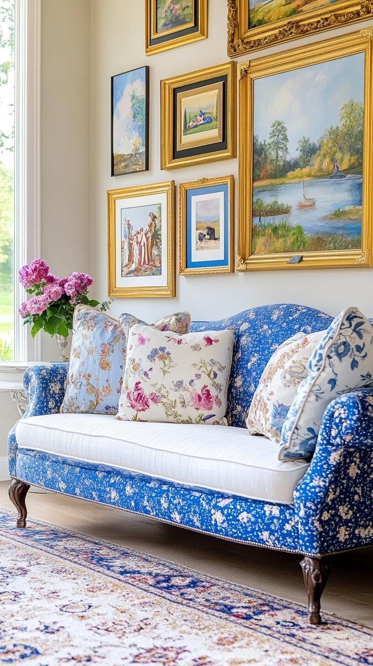
Don’t be fooled, though. Too much gold risks turning your wall into a hall of mirrors at Versailles. Choose art with subtle colors and keep spacing uniform, typically two to three inches apart.
This keeps balance and prevents the look from overpowering your furniture and personality.
32. Oversized duo statement wall featuring two large impactful frames side by side
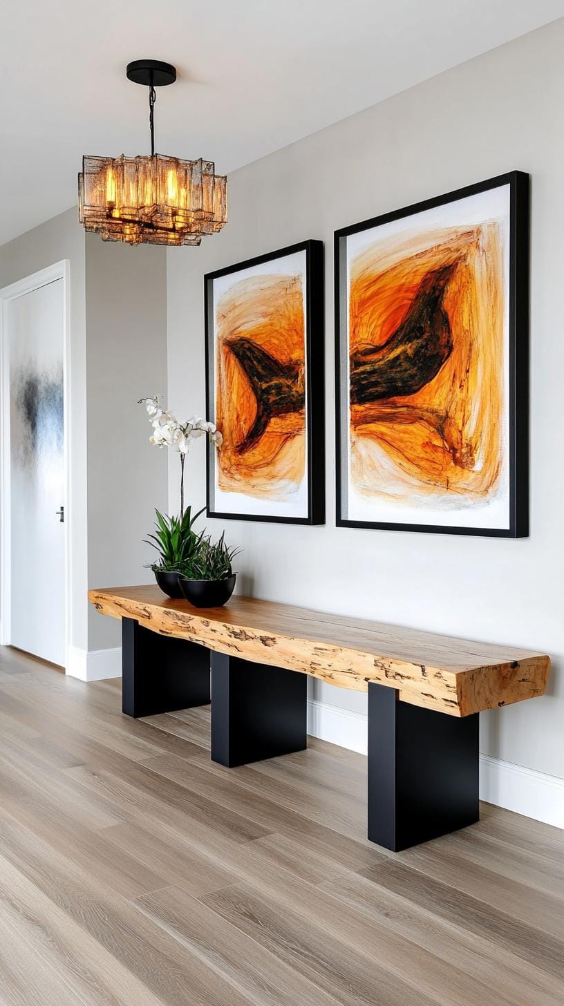
Who says wall art needs to feel cluttered to leave a mark? Hanging two large, bold frames side by side grabs attention instantly.
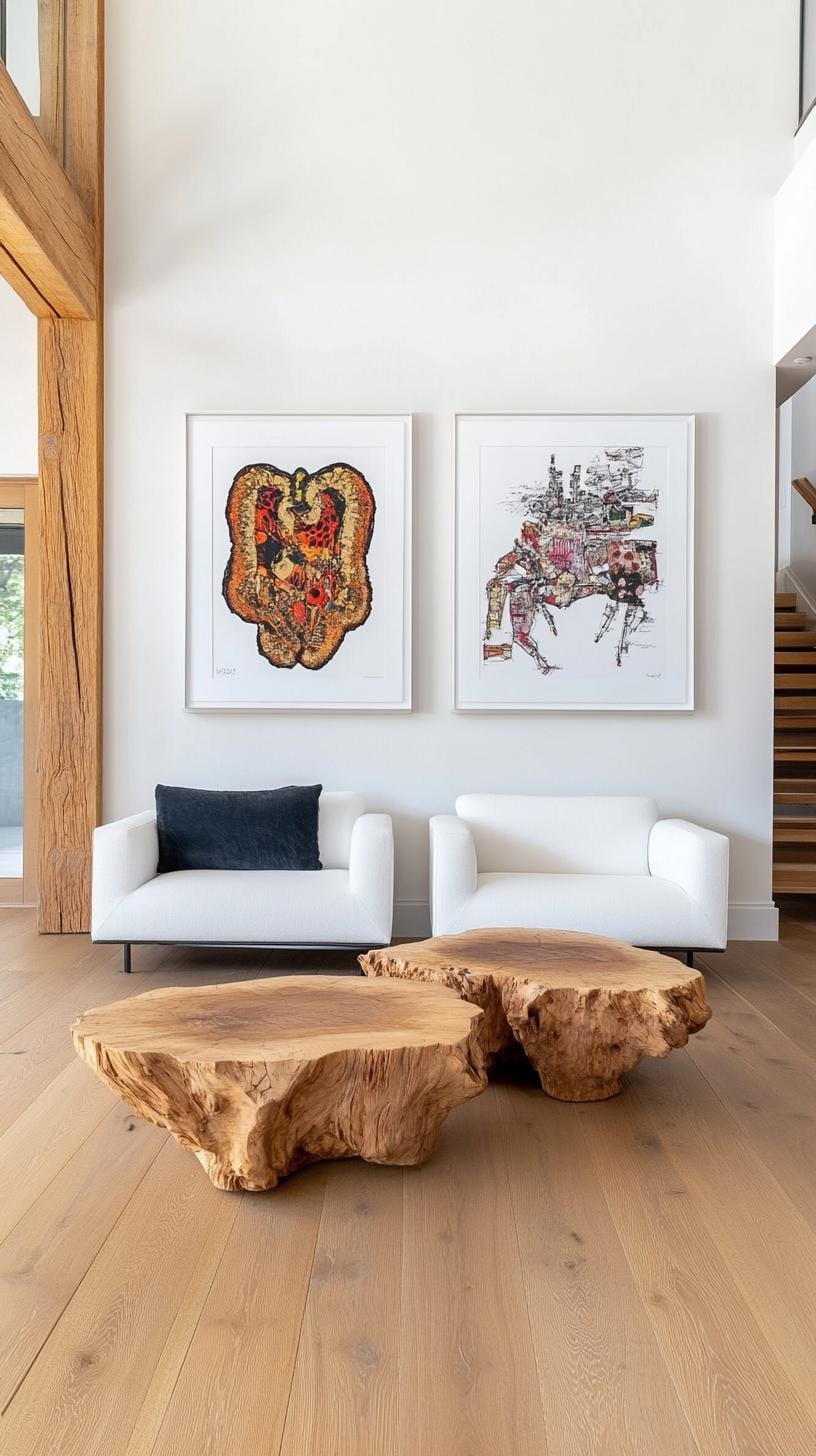
This approach suits big, blank walls, think a bedroom or dining area crying for personality. Less truly is more, especially when balance and contrast steal the show.
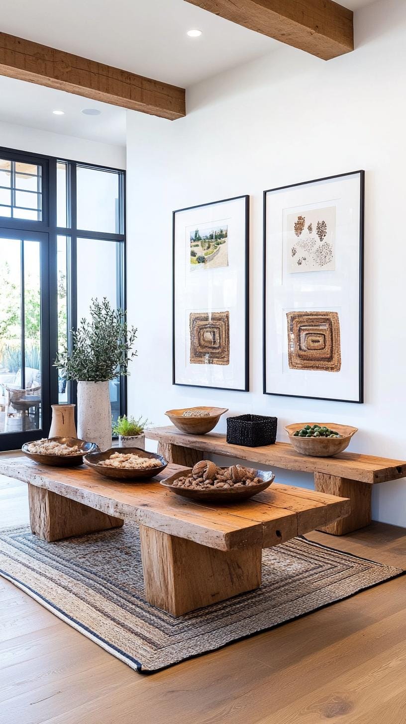
Choosing frames with matching or complementary styles keeps things visually cohesive. Go bold with black-and-white photography, or pick abstract paintings with loud color. The biggest misstep? Ignoring scale, tiny frames drown on wide walls.
Test paper templates first to dodge that visual disappointment later.
33. Seasonal rotating wall grid with an interchangeable layout updated quarterly
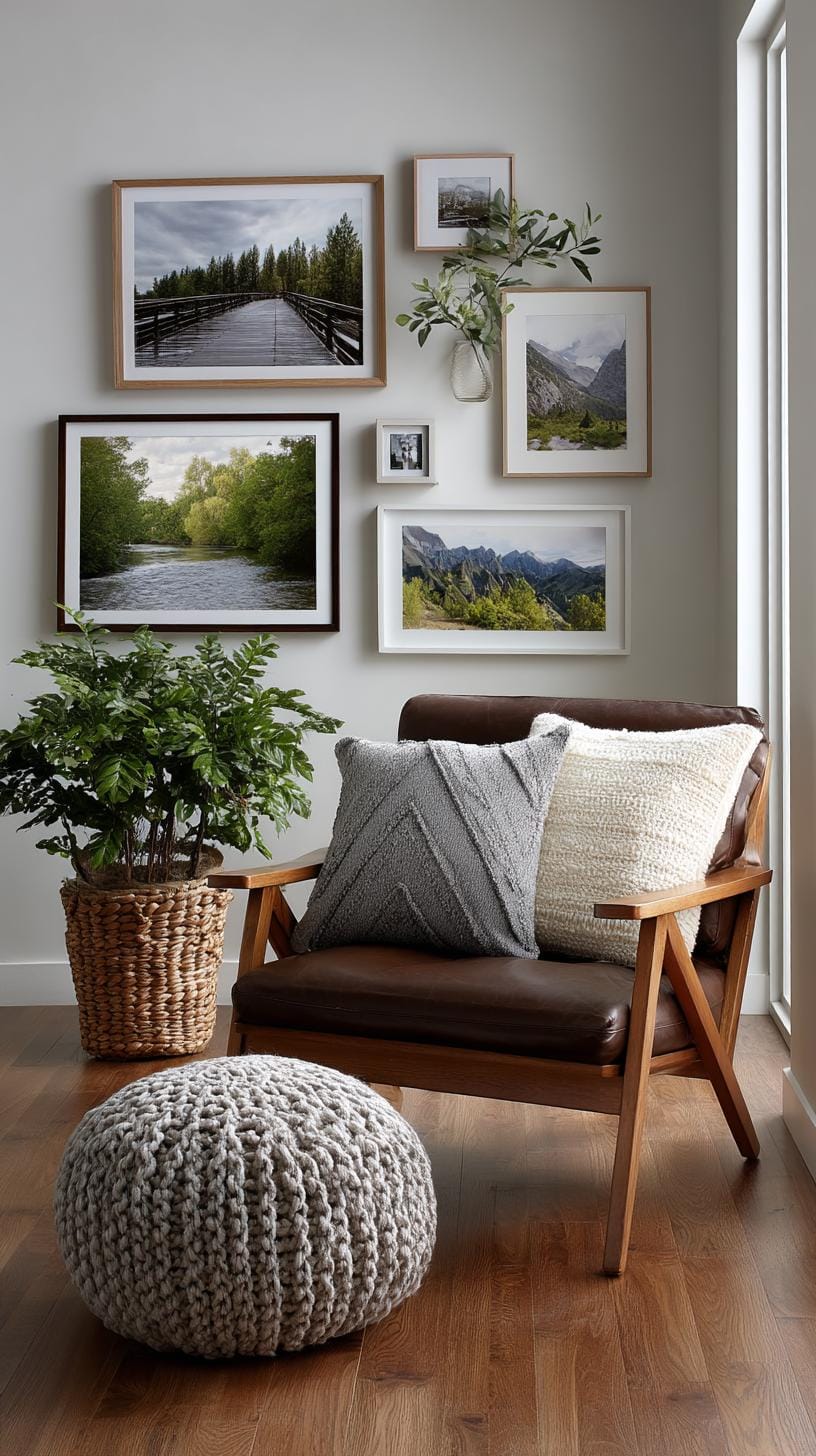
Fed up with your walls staring back at you, bland as a rice cake? A rotating wall grid adds flair without breaking the bank. Hook a wire grid on the wall.
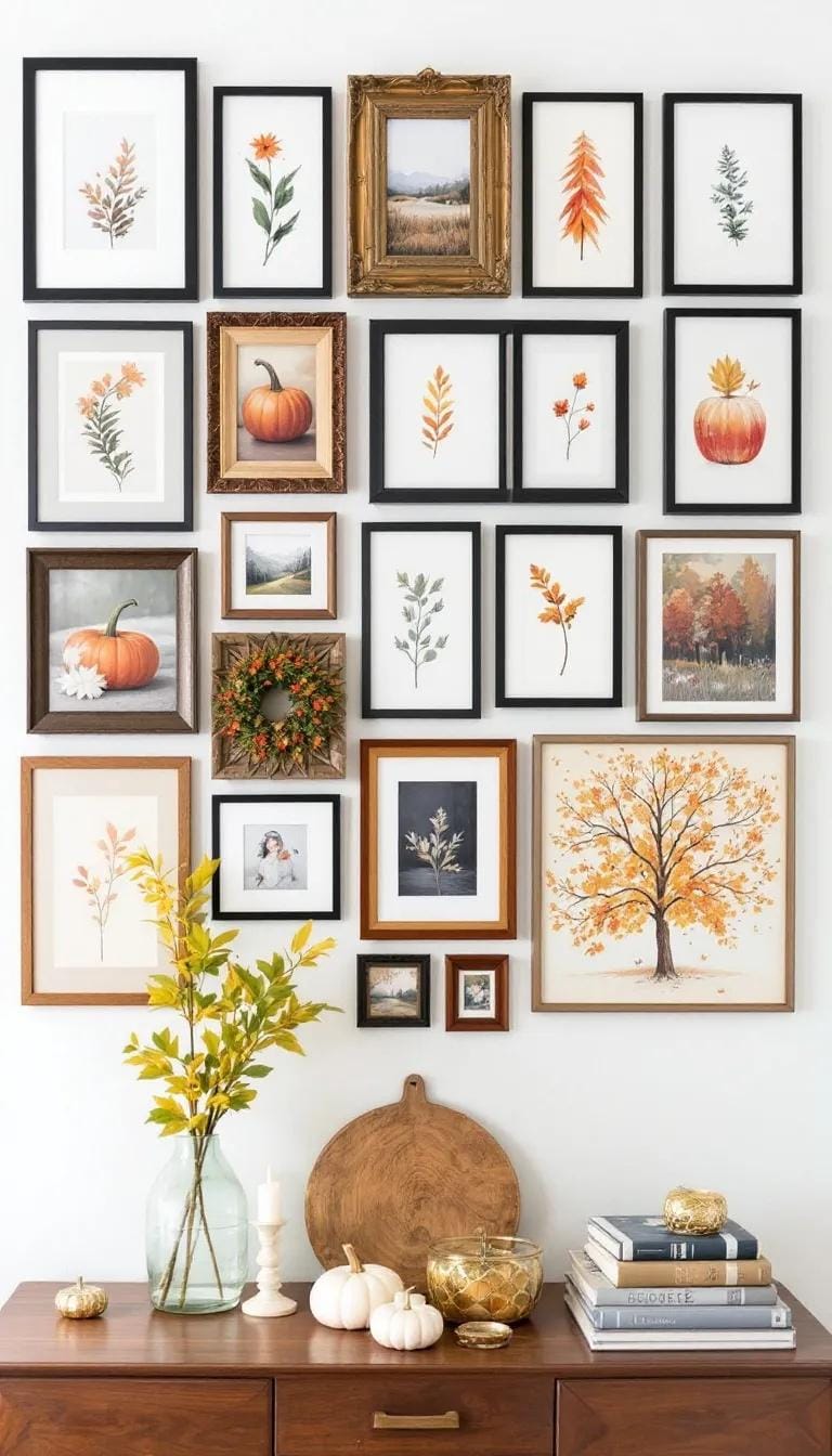
Clip seasonal prints, kids’ art, or postcards. Swap them out every three months. Your space changes, and you don’t spend hours redecorating.
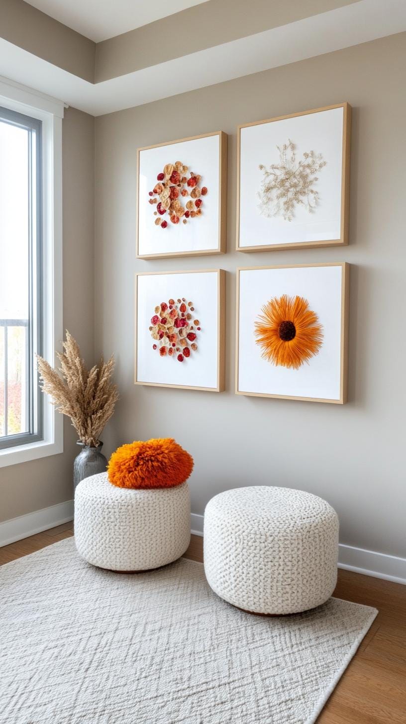
This method also encourages creativity. Display autumn leaves in October, winter landscapes in January, blooming florals come spring. A couple of push pins and a playful mindset are all you need.
The only snag? You’ll need to hunt down new art seasonally. But honestly, isn’t that half the fun?
34. Asymmetrical bold layout that is imbalanced but visually balanced
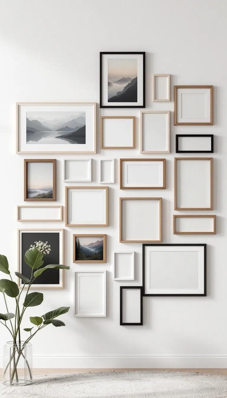
Throwing symmetry out the window shakes things up. An asymmetrical gallery wall lets you combine frames in unpredictable ways, maybe big pieces with tiny accents peppered in between.
This brave approach adds energy and pulls the eye across the whole arrangement, letting your art collection lead the dance, not the ruler.
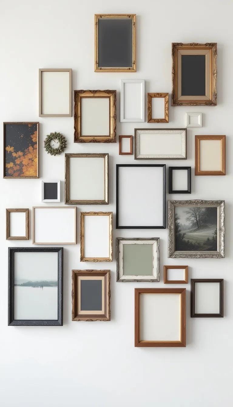
Some fear asymmetry makes decor appear chaotic. In practice, the invisible harmony comes from spacing and repeated color or frame choices.
For example, a large abstract piece can visually anchor one side, while several miniature prints on the opposite end gently restore balance. The thrill? No two walls ever look the same.
35. Modern poster wall style using posters in sleek black metal frames
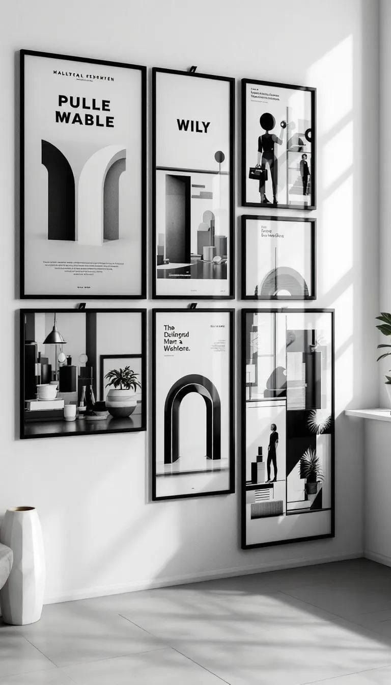
Imagine a blank white wall. Now, punctuate it with posters in slim black metal frames. This look is effortlessly current, offering flexibility for both minimalists and maximalists.
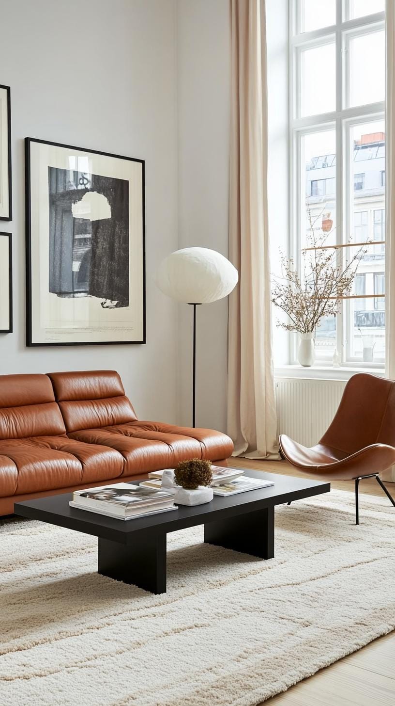
Try mixing abstract prints with urban photography. A grid layout suits clean lines, while playful staggered arrangements inject energy, turning your space into an art-forward statement.
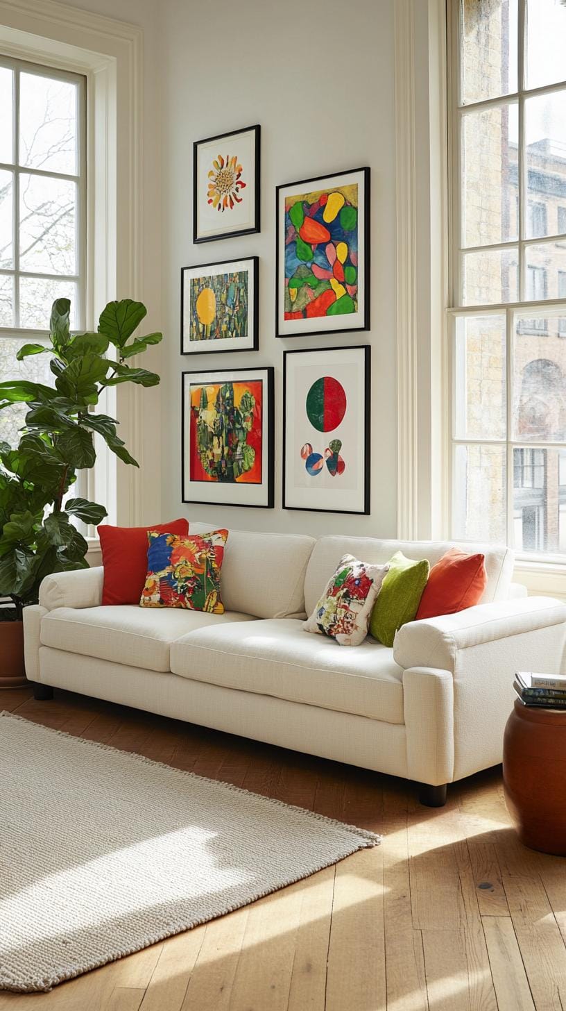
On the practical side, these frames are lightweight and simple to hang. Swapping out posters as trends change is easy.
However, fingerprints do show on black metal, and too many bold designs can feel chaotic. Stick to a simple color palette for balance and let negative space do its magic.
36. Cultural collage arrangement with travel or ethnic prints and textiles
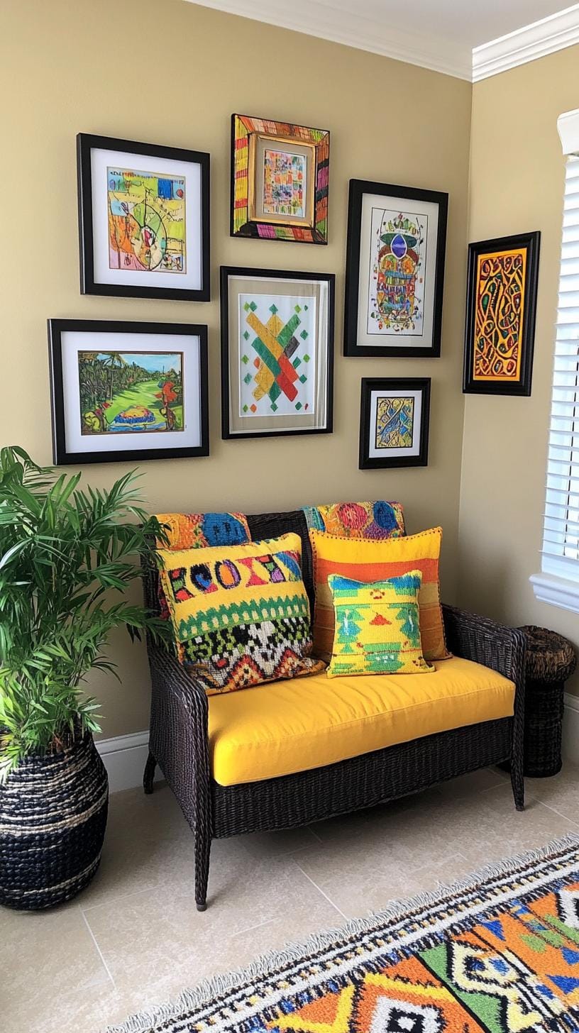
Think of a wall as your passport. Mix travel photos, bold ethnic prints, and textured textiles into a lively arrangement.
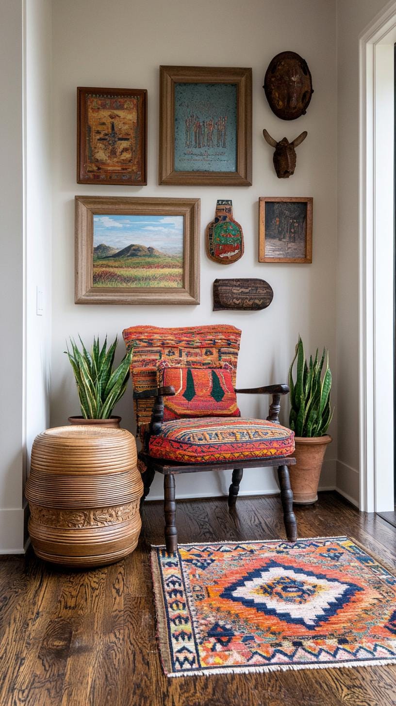
Layer Moroccan rugs, batik fabrics, or woven baskets beside images of your most memorable journeys. This style breeds warmth, nostalgia, and bright conversation starters for anyone visiting your space.
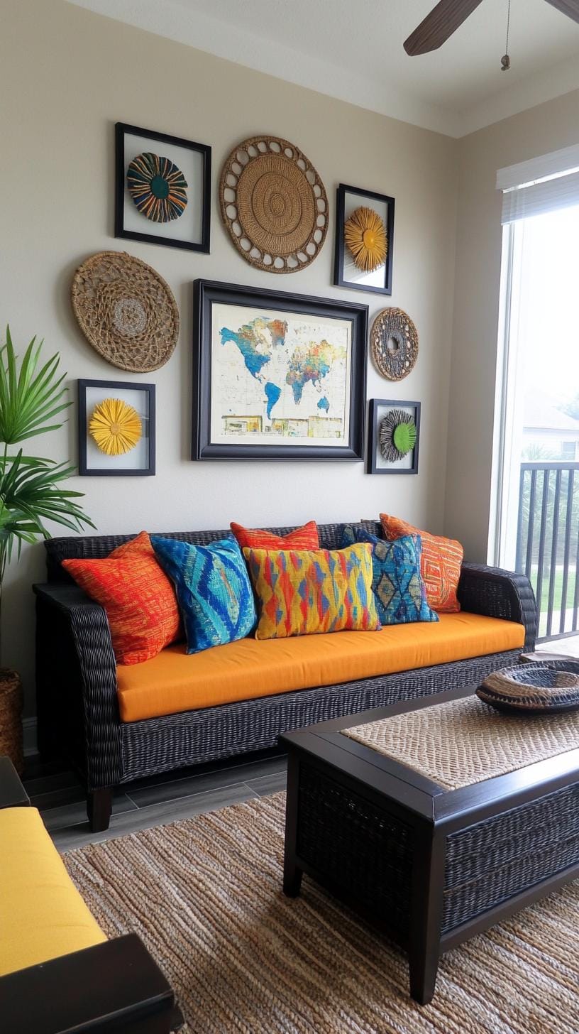
Curious about balance? One trick: keep spacing even between items, even when you mix shapes and sizes. Pair a vivid textile square with a slim photo frame, variety keeps eyes moving.
Some find such eclectic groupings busy, so keep a core color palette to avoid sensory overload.
37. Full wall color coordinated mosaic made from dozens of pieces in one color palette
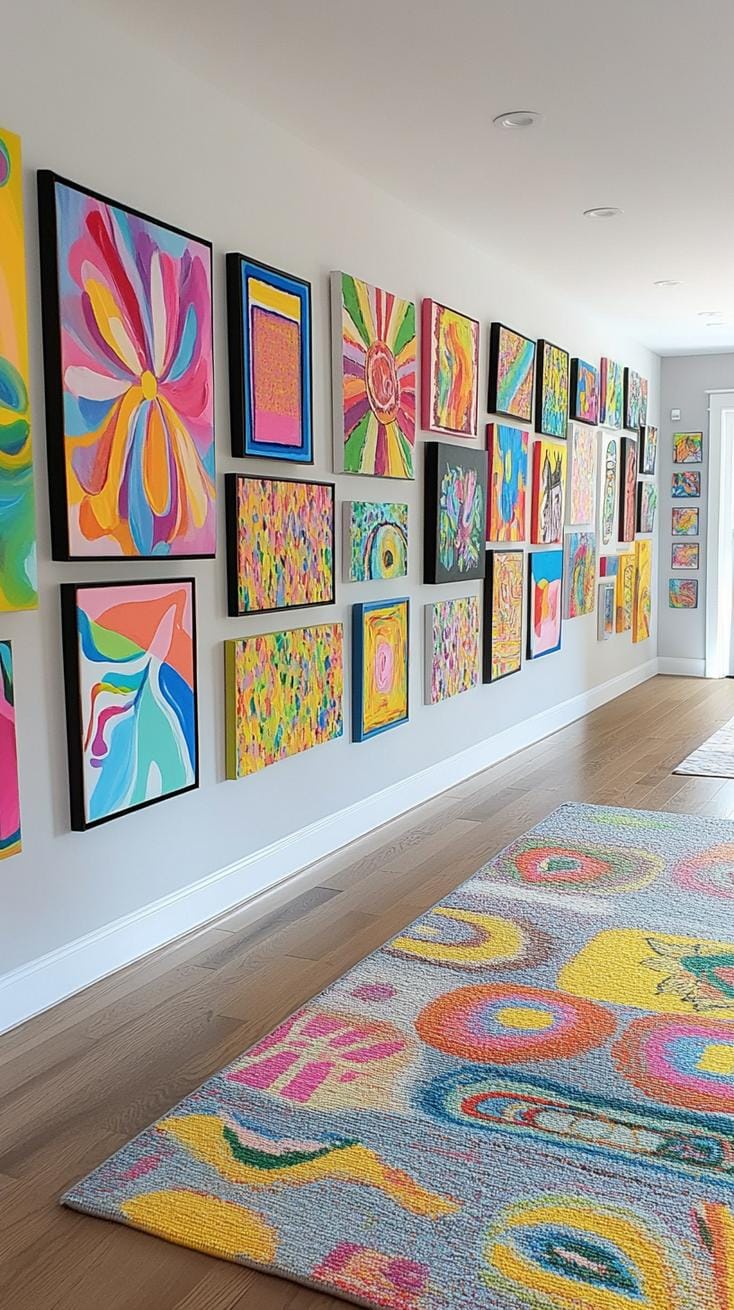
Some people swear by the impact of a full wall, color-coordinated mosaic. Think dozens of art pieces, all singing in the same color family. It’s arresting, yes, but also creates instant unity.
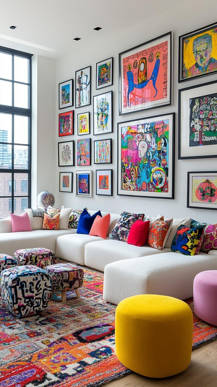
If you’re after wow-factor without chaos, this approach tames visual noise while filling space with personality.
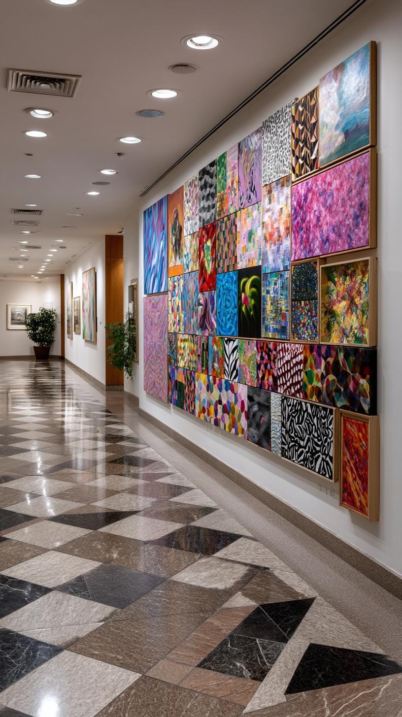
Start with frames in one shade, black, brass, or even grass green. Next, play with art ranging from photographs to geometric prints, all echoing your chosen colors.
The magic is in layering styles, sizes, and textures. Fair warning: this setup eats time and planning. Yet the finished effect can’t be faked by mass-produced options.
Conclusion
Creating a gallery wall is much like cooking, a pinch of symmetry, a dash of bold frames, and suddenly blank walls sing.
Instead of copying catalog clips, try a grid for family photos or a freeform arrangement for travel finds. Your story, your rules.
Ready to take action? Lay your pieces on the floor first, swap spots, and snap a phone photo before hanging. This method prevents regrets and nail holes.
Why let empty walls remain silent when your memories and style can do the talking?
Related Topics:
- Wall Decor Ideas
- Mirror Wall Decor Ideas
- Bedroom Wall Decor Ideas
- Above The Couch Decor Ideas
- Accent Walls In Living Room
